


Filed under: inspirations,miscellaneous,reading and writing,type and typography

On Friday, I received my much anticipated copy of Ruud Linssen’s Book of war, mortification and love in the mail. Published by one of my favourite typefoundries, Underware, the book, which consists of a collection of personal essays on the concept of “voluntary suffering”, also acts as a type specimen for their Blackletter typeface Fakir.
The book is beautifully designed and crafted, which is not a surprise given the quality of Underware’s work. I was pleasantly surprised by how well Fakir reads as a text face though, since I had always considered it a bit of a playful display typeface. Even more impressive is how well it sits in such a serious and sombre context, accentuating the darkness of the essays with its jagged edges.

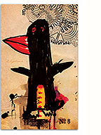
Speaking of a sensitive design accentuating the content, here’s the punchline to this story: the entire book is printed in Linssen’s blood. Yup, you read that right… A book on suffering, the writing of which is born of the author’s own suffering (it took over two years to write and was clearly a personal struggle), has been printed using his very blood. The process of transforming the blood into ink was long and complex as Underware had few precedents to work from, but the result is spectacular. The colour of the ink on the page is without a doubt unique, a rich and saturated red-brown (the above photo does no justice), and the knowledge that it is blood held in your hands creates an effect of reverence, almost sacredness, mixed with uneasiness bordering on disgust while reading.

image taken from Underware’s website
The essays themselves are powefully engaging, linking personal narrative with historic facts. Linssen delves into the nature of suffering from several different angles (religious, literary, military), always returning to a heartfelt exploration of the self. “Why do we choose to suffer?” Linssen certainly proposes no answers but his journey is revealing. It’s been a while since I’ve read a Dutch author, and Linssen’s prose reminds me of why I chose to study there many years ago. His writing is simple, clear and rigorous, yet imbued with humanism and unpretentiousness, much like Underware’s typefaces.
To print this book in blood (and to burn/brand the title into the clothbound cover) might seem like a design gimmick. But when you experience this book as an object, that thought quickly disperses. Underware have dared to make the book a precious, intimate object again. As designers they’ve taken an idea and followed it through to its natural conclusion and made something that I will certainly cherish for a lifetime.
Learn more about the book and the process of its creation on Underware’s website.
6 Comments so far
Leave a comment
hey kevin, that’s really a fantastic post and book.
i wonder: how many copies of the book were actually printed?
hey Oliver, 2000 copies were printed, each one hand-numbered. Mine is 1621!
Comment by kevin 08.16.10 @ 11:07 pmlong time kevin, i saw the making of this book TODAY, and not feeling from the morning.
Google brougt me to your review page.
yours was 1621, would i still have a chance?
it seems… gross, but i can’t stop wanting it.
Comment by youseon 08.19.10 @ 9:34 pmnot feeling WELL i meant
Comment by youseon 08.19.10 @ 9:35 pmHey Youseon, nice to hear from you! I don’t think the books were sold in numerical order, so I’m pretty sure you would still be able to get a copy.
Comment by kevin 08.23.10 @ 8:03 pmhey kevin- 2000 copies: how much blood?
no, really- it’s not a joke question!
Leave a comment
