


Filed under: miscellaneous,reading and writing,type and typography

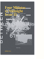
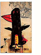
A contentious spread from 032c issue #13
In my current phase of design research, I’ve been enjoying a wealth of ecclectic readings. My friend and craft theorist extraordinaire Nicole Burisch pointed me in the direction of Judith (or rather, Jack) Halberstam‘s excellent introduction to The Queer Art of Failure. In referencing James C. Scott’s Seeing Like A State, he writes:
For Scott, to “see like a state” means to accept the order of things and to internalize them; it means that we begin to deploy and think with the logic of the superiority of orderliness and that we erase and indeed sacrifice other, more local practices of knowledge, practices that may be less efficient, may yield less marketable results, but may also, in the long term, be more sustaining. What is at stake in arguing for the trees and against the forest? Scott identifies “legibility” as the favored technique of high moderism for sorting, organizing and profiting from land and people and for abstracting systems of knowledge from local knowledge pratices. (…) “Legibility,” writes scott, “is a condition of manipulation”. He favors instead, borrowing from European anarchist thought, more practical forms of knowledge that he calls metis and that empahsize mutuality, collectivity, plasticity, diversity, and adaptability. Illegibility may in fact be one way of escaping the political manipulation to which all university fields and disciplines are subject.
Albeit largely due to the use of the term “legibility”, this section sparked some interesting ideas in relation to the material practice of graphic design and typography. Translating the argument literally (pun intended) to design practice, I can’t help but think of the so-called “legibility wars” of the 90s, and to a lesser extent the ideas of vernacular design put forth by the practice of Tibor Kalman. I’ve always felt the deconstructionist work being done by this generation of designers was abandoned too soon (or at least the theory was), as discourse shifted towards “new media” (with a brief moment of introspection on the political potential of design) and aesthetics shifted towards a nostalgic, serious, and safe, faux-modernist/classicist current (largely due, imho, to the events on 9/11 and Dave Eggers).
More recently (well, 2007 recently), Mike Meiré’s “ugly” redesign of culture/fashion mag 032c created a bit of a similar stir, as documented in these posts on Creative Review and Design Observer, though by then it seemed more like the simple circulation of trend cycles (and I would argue MIA’s Arular is the actual cultural touchstone here). Yet in my eyes, there’s still something ecstatic about these images. Their dilution is unsurprising, filtered into current trends of crude geometric sans, paired with bold serif type and basement porn photography, but is there still a potential for radicality here? And if so, in what manner of, or how much, ugly?

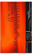
Metahaven is clearly the torch-bearer, with the added bonus of their actual engagement with political and critical theory as design thinker-practitioners. Their intervention as guest-editors for the October 2011 issue of Print Magazine was undeniably subversive, matched-up with the magazine’s regular columns. The feature-well, addressing expansive and controversial ideas on what might constitute graphic design and identity, was not only “ugly”, but near illegible…
On the surface level, the current state of “ugly” was recently encapsulated and anthologized in the Gestalten publication Pretty Ugly, and co-editor Matin Lorenz admits that:
…we think it’s pretty clear that one day there will be overload of empty messages using these aesthetics and people will get bored. You’re already starting to see some of the Photoshop effects and visual gestures repeating over and over again, and there’s less and less space to explore new things within the movement. The more they’re repeating, the bigger the feeling grows that this will come to an end.
– taken from an interview on Sight Unseen
On a deeper level though, beyond the trend cycles and the need for innovation and differentiation (double ugh), I think there could still be a lot to mine here. In CR’s original interview with Meire, a little tidbit stands out for me:
Most of the time my assistant Tim Giesen was stretching types like hell. The idea was getting us into a kind of “darker”. We combined the stretched ones with types from the Helvetica and Futura family and the Times New Roman Condensed. We had to recondition our minds aesthetically wise while we were working on 032c.
Beneath the bright colours and distorted typography, there’s an inherent (if unconscious/unintentional) darkness in this approach that, in my mind, reveals quite simply that things are NOT OK. And I’m thinking that this might be important to hold on to.
Aesthetic co-option into commodified style is inevitable, yet still something I’m constantly grappling with. Seeing it in terms of “legibility/illegibility” can perhaps provide a perspective for re-engagement.
We may in fact want to think about how to see unlike a state; we may want new rationales for knowledge production, different aesthetic standards for ordering and disordering space, other modes of political engagement than those conjured by the liberal imagination.
– Judith Halberstam, from the introduction to The Queer Art of Failure
With an intentionality of practice, can we inscribe the values mentioned in the original quote: mutuality, collectivity, plasticity, diversity, and adaptability — all of which, it should be mentioned, were argued for by designers back in the 90s (well, some of them) — into the text without falling into formalistic tropes, old or new?
Positioning arguments for the new ugly could sound pretty similar to those made for the old ugly; democratisation of tools (default design), revealing process-work, multiplicity of perspectives/readings, honouring the vernacular, humour and unseriousness, etc. All of it hinted with a little more cynicism given our current neoliberal cultural context. Yet the old arguments against it haven’t really reared their head (outside of an article here and there), perhaps because no one cares anymore (about the state of graphic design in general, even).
—
I’d like to take a detour back into considerations of materiality, in relationship to the quote from Hal Foster I referenced earlier:
…in the best instances, a double reflexivity is at work: a medium is (re)constituted in a recursive way that is nonetheless open to social content—in a way, moreover, that reminds us that “form” is often nothing but “content” that has become historically sedimented.
– Hal Foster, This Funeral is for the Wrong Corpse
In thinking of the ‘failures’ of certain mediums and technologies, as points in time where things could have gone one way or another, I wonder about the recursive potential of investigations into the material production methods of graphic design.

Though it might be a bit of a stretch, Kris Sowersby’s enlightening post on the process of developing his lovingly crafted Pitch typeface, reveals the kind of anachronistic obsession (perhaps unique to type designers & typographers) that places (moral?) value on traditions of craft, and (in some ways) against modernist models of efficiency.
This could easily be read into other production practices, notably print techniques, as seen in the rise in popularity of Risograph printing (and here I should give a shoutout to JP King!), and the fetishisation of the tactile quality of letterpress, silkscreen, etc. (shoutout to Rebecca Rosen!). Though the general appeal of these techniques is easily understandable, interrogating what underlies their current fetishisation, and the contradictions of a necessarily highly skilled anachronism (or a highly anachronistic skill set — certainly not vernacular or populist anymore), might reveal some insights into the embedded/sedimented ideology of their material forms. A genuine reaction against the “hegemony of smooth surfaces” or equally a marker of rareified distinction? Nicole’s research into craftwashing might be particularly useful here.
If greenwashing is understood as the use of branding to make a product seem more eco-friendly while concealing its negative impacts, then we have begun to use the term “craftwashing” to refer to instances where craft (or a crafted aesthetic) is being used to market lifestyles and/or fashionable goods in a way that obscures the sticky ethical, environmental, and economic effects of their production.
– Performed Austerity, Nicole Burisch and Anthea Black
And for a counterpoint, or more as a related aside, this interview with Andrew Steeves of Gaspereau Press, addressing the integrity of small-press printing and publishing, is a reaffirming read.
So what this isn’t — I guess this is the best way to say it — is some kind of slavish celebration of things that are the slowest, or things that are the hardest. It’s not some kind of fetish of physical process. In fact, we use a really broad range of processes here, from really old to really cutting-edge. And we like to sort of mash them together, actually, and use them on the same object. In service of the text and in service of the reader.
The account of the uproar around Johanna Skibsrud’s Giller Prize provides a pithy example of the potential for an ‘antagonism of anachronism’ within a market-based society.
—
At this point, I realise this post is rambling, and the arguments (if they even exist) imprecise. But I’m using this as a way of publicly working through my thinking, a kind of “low theory”. And given that, I might as well wrap up with an extract of a poem sent to me on facebook:
Perhaps another day one will want to review all this
For today it looks compressed like lines packed together
In one of those pictures you reflect with a polished tube
To get the full effect and this is possible
I feel it in the lean reaches of the weather and the wind
That sweeps articulately down these drab streets
Bringing everything to a high glossYet we are alone too and that’s sad isn’t it
Yet you are meant to be alone at least part of the time
You must be in order to work and yet it always seems so unnatural
As though seeing people were intrinsic to life which it just might be
And then somehow the loneliness is more real and more human
You know not just the scarecrow but the whole landscape
And the crows peacefully pecking where the harrow has passed
– John Ashberry, Lithuanian Dance Band
It occurs to me that in terms of highly skilled anachronisms, poetry in and of itself sets a pretty stellar example, caught in margins and out of time, “illegible” and “ugly”, to the very point of being beautiful. Useless to the point of necessity.
More. Thinking. Soon.
2 Comments so far
Leave a comment
Good read Kevin. Would love to see more from you on this subject as these thoughts percolate!
Comment by Kirsten 12.23.12 @ 9:08 pmThanks Kirsten. I’m taking the month “off” to develop some of this thinking as I work towards the next issue of Four Minutes to Midnight. Hopefully we can have a good chat about all this sometime soon! I would love to have your insight!
Comment by kevin 01.03.13 @ 1:12 amLeave a comment
