Great little documentary on Inkahoots, an inspiring design studio we very much look up to.
0 Comments


Great little documentary on Inkahoots, an inspiring design studio we very much look up to.
I’m questioning why I do what it is that I do. Right now, with less than 3 days till launch, QA on the project hardly started, clients breathing down our necks. Unformatted content still coming in from halfway across the world. And a studio barely scraping by.
I try to go back in my mind to remember those points in my life when I made the decision to keep hustling along this path, and not give in and try something else. Or at least get a 9 to 5. And I try to remember a work of graphic design that actually impacted my life. Added meaning. That answered the why instead of the what.
A beautiful video of pure letterpress goodness, from a master of the craft. More info here.
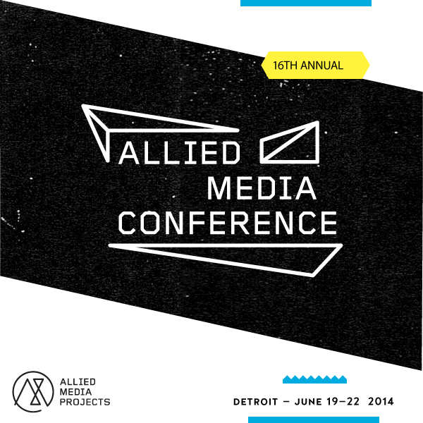
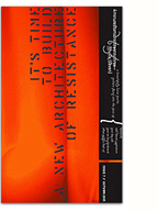
This week I’ll be heading to Detroit to participate in the 16th Annual Allied Media Conference. I’m very excited, and slightly nervous, to be presenting a caucas/workshop on Designing Cultures of Resistance.
Extending from the talk I gave at Howl’s Art, Anarchism and Social Movements panel, I want to continue to explore the concrete aspects that surround the practice graphic design, or a specific designed object, and discuss how they can contribute to building a healthy and vibrant culture of resistance (to neoliberal capitalism). My angle comes from a bit of a Neo-Marxist perspective, and the aspects I’ll be looking at are: Materiality and Affect, the contexts of Production and Distribution, (Visual) Language and Identity. Typed out like this, it seems a bit daunting and a bit vague, but the goal is to not be overly theoretical, to ground it in concrete objects and experiences, and most importantly, to engage and listen to what others have to say.
I’m really looking forward to taking in as much as I can of what the conference has to offer, to meet so many great people doing such amazing work, and to get the chance to build something together…
I’m copying + pasting their network principles below, because they’re beautiful and righteous, and they’ll give you a good idea of why I’m so stoked. See you in Detroit!
We are making an honest attempt to solve the most significant problems of our day.
We are building a network of people and organizations that are developing long-term solutions based on the immediate confrontation of our most pressing problems.
Wherever there is a problem, there are already people acting on the problem in some fashion. Understanding those actions is the starting point for developing effective strategies to resolve the problem, so we focus on the solutions, not the problems.
We emphasize our own power and legitimacy.
We presume our power, not our powerlessness.
We spend more time building than attacking.
We focus on strategies rather than issues.
The strongest solutions happen through the process, not in a moment at the end of the process.
The most effective strategies for us are the ones that work in situations of scarce resources and intersecting systems of oppression because those solutions tend to be the most holistic and sustainable.
Place is important. For the AMC, Detroit is important as a source of innovative, collaborative, low-resource solutions. Detroit gives the conference a sense of place, just as each of the conference participants bring their own sense of place with them to the conference.
We encourage people to engage with their whole selves, not just with one part of their identity.
We begin by listening.

Beautiful, abstract, print works by Berlin-based designer and printmaker Damien Tran. After all the language stuff I’ve been playing with, I think I want the next zine to feel like this.

Jack Allen pointed me towards this beautiful visual essay by designer and artist Paul Soulellis. In it he narrates and argues for a counterpractice of design that I can very much sympathise with. It’s an inspirational read for the new year, and will surely help to guide how I approach my projects in 2014.

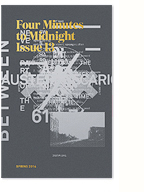
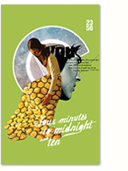
Updates are slow on the zine, but things are happening nonetheless. Meanwhile follow lokimon on tumblr, updated far more frequently with plenty of inspirational imagery.
Tumblr mosaic created here.
I’ve mentioned the International Typographical Union in a few of my recent blog posts, both the historical union itself and the design group aligned to, and inspired by it. Above is a short slide show showcasing projects by the latter group, and below is a concise contextual history of the former that I’ve written for the next issue of FMTM.
The International Typographical Union was the first national labour union in the United States, founded on May 5, 1852 (the name was changed from National to International in 1869 after it began organizing members in Canada). The I.T.U. was composed of typesetters, printers, apprentices and journeymen, and was considered one the most democratic and progressive unions; condemning Sunday work, actively supporting organizing efforts by other craft unions, and being among the first to institute membership by women, with Augusta Lewis Troup becoming the first woman (in 1870) to hold a national office. In 1906, the I.T.U. secured the eight-hour work day through the use of tactical strikes in major cities, paving the way for a standard that would be implemented across other industries. After World War I, when employers sought to lengthen the work day to 12 hours , the I.T.U. fought back with massive strikes across the country, engaging in a three-year long battle that cost employers dearly, successfully defending the union’s significant gains.
On December 31, 1986, the I.T.U. dissolved, largely due to the automation, mechanization and digitalization of the trade. The remnants of the union membership merged with the Communications Workers of America and the International Brotherhood of Teamsters.
More great slideshows by Charlotte Cheetham on printed matter here.

I recently stumbled across this fascinating article from the Walker Art blog describing designer Sang Mun’s degree project at RISD: ZXX. ZXX is a type design project that attempts to “articulate our unfreedom” through the design of a typeface that cannot be decoded by OCR technologies. In light of the recent revelations about the NSA Prism program , this project is particularly relevant.
What’s interesting to me is how this project seems to bring together inherent aesthetic cues of the “ugly” trend (I really need to come up with a better term for my understanding of this) that I’ve been discussing here (the distortion/layering of type elements and placement, the concept of default/open-source design, issues of illegibility/accessibility, through to the presentation of the project) with a critical social commentary of the surveillance state and privacy concerns. It makes me wonder whether this “state of anxiety” may be at the root of the aesthetic currents running through graphic design practice.
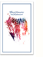
What’s also really encouraging is that ZXX might be a representation of a re-engagement with design language, and typography/type design specifically, as a form of critical engagement and aesthetic experimentation, much like Neville Brody’s FUSE project from the 90s. Hopefully it’s not just closing a loop, but a “sign” (pun intended) of things to come. I’ll certainly be taking some of these cues into, and using the typeface within, the next issue of Four Minutes to Midnight.
See more of the project, and download the typeface, here.
