WU-TANG Letterpress Prints

For Expozine this year, I’ve reissued a run of my WU-TANG C.R.E.A.M. diptych, letterpress printed in gold ink on thick black cardstock by Kiva Stimac at Popolo Press. This edition is printed on her new letterpress, and the imprint is slightly deeper, giving it more relief and emphasizing the epitaph metaphor of the design.
(more…)
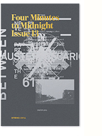
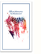
Issue 13 WIP

Things are coming along slowly, but surely, with the next issue (13) of Four Minutes to Midnight and I wanted to share some work in progress images. Alongside a much tighter conception of what we want to do with the issue, I’m very excited to announce that Howl Arts will be officially supporting the project with production and distribution. With this support, we’ve decided to print an offset run in colour for the first time ever! We also plan to engage the talents of local craft printers, and employ letterpress, silkscreen and risograph printing for covers and inserts.
(more…)
Neptune’s Moons Poster

Show poster designed for the upcoming Neptune’s Moons concert presented by the Howl Arts Collective. Though the central graphic acts as a literal interpretation of the title, the poster also makes subtle reference to Afro-futurist aesthetics and sci-fi 70s funk in the digitally-lettered title treatment. It’s too bad we won’t be printing this with glow-in-the-dark ink!
In conceiving of the show, Kaie highlighted this quote by Marc Dery:
“Hack this: Why do so few African-Americans write science fiction, a genre whose close encounters with the Other — the stranger in a strange land — would seem uniquely suited to the concerns of African-American novelists? Yet, to this writer’s knowledge, only Samuel R. Delany, Octavia Butler,Steve Barnes, and Charles Saunders have chosen to write within the genre conventions of SF. This is especially perplexing in light of the fact that African-Americans are, in a very real sense, the descendants of alien abductees. They inhabit a sci-fi nightmare in which unseen but no less impassable force fields of intolerance frustrate their movements; official histories undo what has been done to them; and technology, be it branding, forced sterilization, the Tuskegee experiment, or tasers, is too often brought to bear on black bodies.”
– Mark Dery, Black to the Future
Word.
Neptune’s Moons event page here.
ZXX

I recently stumbled across this fascinating article from the Walker Art blog describing designer Sang Mun’s degree project at RISD: ZXX. ZXX is a type design project that attempts to “articulate our unfreedom” through the design of a typeface that cannot be decoded by OCR technologies. In light of the recent revelations about the NSA Prism program , this project is particularly relevant.
What’s interesting to me is how this project seems to bring together inherent aesthetic cues of the “ugly” trend (I really need to come up with a better term for my understanding of this) that I’ve been discussing here (the distortion/layering of type elements and placement, the concept of default/open-source design, issues of illegibility/accessibility, through to the presentation of the project) with a critical social commentary of the surveillance state and privacy concerns. It makes me wonder whether this “state of anxiety” may be at the root of the aesthetic currents running through graphic design practice.
What’s also really encouraging is that ZXX might be a representation of a re-engagement with design language, and typography/type design specifically, as a form of critical engagement and aesthetic experimentation, much like Neville Brody’s FUSE project from the 90s. Hopefully it’s not just closing a loop, but a “sign” (pun intended) of things to come. I’ll certainly be taking some of these cues into, and using the typeface within, the next issue of Four Minutes to Midnight.
See more of the project, and download the typeface, here.
Illegibility, Ugliness and Counter-Hegemony

A contentious spread from 032c issue #13
In my current phase of design research, I’ve been enjoying a wealth of ecclectic readings. My friend and craft theorist extraordinaire Nicole Burisch pointed me in the direction of Judith (or rather, Jack) Halberstam‘s excellent introduction to The Queer Art of Failure. In referencing James C. Scott’s Seeing Like A State, he writes:
For Scott, to “see like a state” means to accept the order of things and to internalize them; it means that we begin to deploy and think with the logic of the superiority of orderliness and that we erase and indeed sacrifice other, more local practices of knowledge, practices that may be less efficient, may yield less marketable results, but may also, in the long term, be more sustaining. What is at stake in arguing for the trees and against the forest? Scott identifies “legibility” as the favored technique of high moderism for sorting, organizing and profiting from land and people and for abstracting systems of knowledge from local knowledge pratices. (…) “Legibility,” writes scott, “is a condition of manipulation”. He favors instead, borrowing from European anarchist thought, more practical forms of knowledge that he calls metis and that empahsize mutuality, collectivity, plasticity, diversity, and adaptability. Illegibility may in fact be one way of escaping the political manipulation to which all university fields and disciplines are subject.
Albeit largely due to the use of the term “legibility”, this section sparked some interesting ideas in relation to the material practice of graphic design and typography. Translating the argument literally (pun intended) to design practice, I can’t help but think of the so-called “legibility wars” of the 90s, and to a lesser extent the ideas of vernacular design put forth by the practice of Tibor Kalman. I’ve always felt the deconstructionist work being done by this generation of designers was abandoned too soon (or at least the theory was), as discourse shifted towards “new media” (with a brief moment of introspection on the political potential of design) and aesthetics shifted towards a nostalgic, serious, and safe, faux-modernist/classicist current (largely due, imho, to the events on 9/11 and Dave Eggers).
(more…)
It begins in the book…
I’m so excited to come across James Stuart’s Master’s Thesis “It Begins in the Book: Writing the Material Poem” freely available online. An expansive thesis, it comprises an 80-odd page exegesis and 3 creative projects (The Material Poem, The Homeless Gods and Conversions). The overlap between his interests and my own is startling, given the niche nature of my concerns.
My reading of Stuart’s written thesis has sparked many ideas for my own research, specifically around his three-pronged model of materiality:
“what enables, and how does, a reader to respond to a literary work (material basis); what socio-cultural forces influence the relationship between writers, readers and the language-object (materialism); and finally, the actual material expression (or materiality) of a language-object.”
Coming from his background as a poet, Stuart’s examples and references are new and fascinating to me, and his analytic focus on poetry (specifically in its definition re: its material basis) has given me a lot to chew on.
(more…)
2 quotes + an image

Tomato, mmm… skyscraper, I love you.
“…in the best instances, a double reflexivity is at work: a medium is (re)constituted in a recursive way that is nonetheless open to social content—in a way, moreover, that reminds us that “form” is often nothing but “content” that has become historically sedimented.”
– Hal Foster, This Funeral is for the Wrong Corpse
“Literature in the written sense represents the triumph of language over writing: the subversion of writing for purposes that have little or nothing to do with social and economic control.”
– Robert Bringhurst, The Solid Form of Language
Thinking through some things as I embark on the research and conception phase for the next issue of Four Minutes to Midnight, specifically around the materiality of texts. It’s all a little vague right now, but I feel I’m working towards something quite original and interesting. Here’s hoping. I’ll be documenting my process on here as I go…
2 Poems

For Expozine this year, John and I pulled together this small zine consisting of two hard-wrought poems. The poems were composed/written by us over the course of 4 days and nights, addressing our tried and true themes of love and loss, gentrification and war, isolation and community, solidarity and suicide.
Despite the short timeline (we were stapling and folding into the wee hours of Saturday morning), I’m really proud of these little poems and the elegantly restrained format and typography. The zine was published in a limited edition of 50 copies.
Download a PDF of 2 poems here.
Read 2 poems online on Issuu.
Cinema Politica Selections

Continuing my collaboration with Cinema Politica, “Selections” presents an extensive catalogue of CP’s Canadian films, artist and project profiles, photos of locals, etc. recapping the last year of the organisation’s activity. It celebrates and details the important work being done by CP, and acts as an engaging tool for outreach and promotion.
Despite the limited production budget, the booklet provided a good opportunity to push Cinema Politica’s visual identity (developed by us last year), through the use of powerful imagery and a cinematic format, a refined typographic palette and layout, and crisp one-colour (interior) printing on a nice, matte stock.
Additional design assistance by Kim Tsui, printing by Kata Soho.
(more…)