Arometis

Vision Diversité came to us looking for a visual design for their musical project Arometis that would embody the diversity of the 17 Montreal musicians and composers that collaborated on the album.
Looking to move away from the stereotypes and clichés of the world music genre, we used scans of old wood type lettering, ink splatters and a unique colour palette to reflect the vibrancy of the music, paired with restrained and nuanced supporting typography. The art direction of the CD packaging has been extended across all platforms, giving a cohesive identity to this unique project that weaves musical styles, and musicians, together.
(more…)
Popolo Press

There’s a new website up for Popolo Press, run by Kiva Tanya Stimac, who is responsible for so many of Montreal’s beautiful letterpress show posters over the years. Firmly rooted in the ideology and philosophy behind Montreal’s independent scene, Popolo Press’ work is meticulously crafted, locally-bound and offered to the public with a lot of love. I’m looking forward to having the opportunity to work with them in the future.
Check it out!
UPDATE: A great interview with Kiva up on Felt and Wire.
Emigre PDF specimens

Mrs. Eaves, the first typeface I fell in love with…
It’s hard to overstate the impact Emigre magazine had on my graphic design training. Beyond being the purveyors of a distinct typographic style that embodied the age I grew into design, the magazine hosted the critical discussion of design as a deeply rhetorical practice that was unavailable anywhere else, and sadly, has been clearly lacking since its demise in 2005 (well worth the read!).
Emigre recently announced that their collection of beautiful type specimen catalogues are now available online as downloadable pdfs. Taken together, they form a great overview of the foundry’s history, and more generally of a distinct period of graphic design exploration (not that their typefaces have lost their relevancy today).
Collect them all!
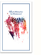
Vox: Versus

I’m a little late posting this one, but I finally got my hands on a copy of Kaie Kellough‘s latest album, Vox: Versus, which I designed back in May. Kaie is an amazing Montreal-based poet, whose work deconstructs and reconstructs language, blending word-games with sound poetry, dub and jazz. The collected works on this latest offering present a series of collaborations with a group of talented local musicians, exploring the roots of rhythm, language and the inherent politics within them (ArtThreat interview with Kaie here).
(more…)
LCC Roundabout Show
I’m currently computerless in London right now (my apologies for the lack of images and brevity of this post), but I thought it would be worthwhile to share the news of the BA & FDA Roundabout show at my Alma mater, the London College of Communication. I was at the private view last night, and it was truly overwhelming (as is London in general, I’m finding) with the sheer scale, diversity and spectacle of the event. Not to mention the incredible talent involved!
If you’re in London over the next week, be sure to check it out. I was particularly impressed by the Design for Graphic Communication cohort and the work from the Graphic and Media Design Typo/Graphics course.
Anja Groten and Janneke de Rooij

Sandbergh Wednesday Lectures poster by Anja Groten

Eurovision 3000 report spread by Anja Groten and Janneke de Rooij
It was such a pleasure to meet these brilliant ladies from the Sandbergh Institute last week in Nijmegen. Check out Anja and Janneke’s work and prepare to be amazed by Dutch design goodness!
If you’re in Amsterdam next month, their diploma show The Future’s so Bright, I Gotta Wear Shades promises to be something special.
Emilie Grenier: Comme des Machines

Emilie Grenier is a close friend and collaborator; a talented, multidisciplinary artist whose work focuses on narrative, interactive experience and materiality. For her application to Central St. Martin’s Textile Futures MA, I designed a limited-edition artist’s book/portfolio showcasing her multi-faceted work.

The book consists of a long 50-page accordian fold, allowing readers to pull out and lay out sections of pages, creating their own narrative through Emilie’s work. The pages were beautifully printed by Photosynthese and expertly bound into book form by Fran Sendbuehler at No Bar Code Press. The tactile qualities of the rich inks, paper and binding make it a pleasure to hold and to fold.
And yes, of course she got in! Congrats Emi!
Many more photos after the jump.
(more…)
Throw all your love against the wall…

I designed this typographic poster at the request of my good friend Sarah Boris, for SoUp (East London) and Joiners Arms “Make Soup Not War” exhibition/event at Cordy House. Given the theme, I was inspired by the revolutions happening in North Africa and the Middle East and decided to pay tribute with this design.
I’d been looking for an occasion to use Non-format’s Otto typeface for a while, and it does most of the work here, paired with a few well chosen words and a heart-felt sentiment. The A3 posters were beautifully Risograph printed by London’s Ditto Press.
(more…)
Sam Winston

I had been meaning to write a post about my obsession with typography for a while now, as I feel it’s something I’ve neglected on this site, but unfortunately I still haven’t found the time. Then I discovered Sam Winston‘s beautiful, poetic, obsessive, intelligent and meticulous art work. Winston’s explorations mirror a lot (if not all) of my interests in type and language, but his execution is far more exacting, patient, and painstaking I imagine.
I’ll save my intended post for another time, there’s certainly much more to say, but for now, enjoy Sam’s work.
(more…)