I.T.U.
I’ve mentioned the International Typographical Union in a few of my recent blog posts, both the historical union itself and the design group aligned to, and inspired by it. Above is a short slide show showcasing projects by the latter group, and below is a concise contextual history of the former that I’ve written for the next issue of FMTM.
The International Typographical Union was the first national labour union in the United States, founded on May 5, 1852 (the name was changed from National to International in 1869 after it began organizing members in Canada). The I.T.U. was composed of typesetters, printers, apprentices and journeymen, and was considered one the most democratic and progressive unions; condemning Sunday work, actively supporting organizing efforts by other craft unions, and being among the first to institute membership by women, with Augusta Lewis Troup becoming the first woman (in 1870) to hold a national office. In 1906, the I.T.U. secured the eight-hour work day through the use of tactical strikes in major cities, paving the way for a standard that would be implemented across other industries. After World War I, when employers sought to lengthen the work day to 12 hours , the I.T.U. fought back with massive strikes across the country, engaging in a three-year long battle that cost employers dearly, successfully defending the union’s significant gains.
On December 31, 1986, the I.T.U. dissolved, largely due to the automation, mechanization and digitalization of the trade. The remnants of the union membership merged with the Communications Workers of America and the International Brotherhood of Teamsters.
More great slideshows by Charlotte Cheetham on printed matter here.
ZXX

I recently stumbled across this fascinating article from the Walker Art blog describing designer Sang Mun’s degree project at RISD: ZXX. ZXX is a type design project that attempts to “articulate our unfreedom” through the design of a typeface that cannot be decoded by OCR technologies. In light of the recent revelations about the NSA Prism program , this project is particularly relevant.
What’s interesting to me is how this project seems to bring together inherent aesthetic cues of the “ugly” trend (I really need to come up with a better term for my understanding of this) that I’ve been discussing here (the distortion/layering of type elements and placement, the concept of default/open-source design, issues of illegibility/accessibility, through to the presentation of the project) with a critical social commentary of the surveillance state and privacy concerns. It makes me wonder whether this “state of anxiety” may be at the root of the aesthetic currents running through graphic design practice.
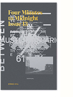
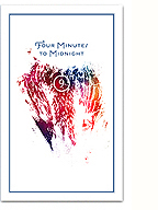
What’s also really encouraging is that ZXX might be a representation of a re-engagement with design language, and typography/type design specifically, as a form of critical engagement and aesthetic experimentation, much like Neville Brody’s FUSE project from the 90s. Hopefully it’s not just closing a loop, but a “sign” (pun intended) of things to come. I’ll certainly be taking some of these cues into, and using the typeface within, the next issue of Four Minutes to Midnight.
See more of the project, and download the typeface, here.
Some thoughts on “Critical Graphic Design”

Last weekend I was invited to participate in a small symposium/dinner at the N/A space in Toronto on the subject of “Critical Graphic Design”. Organised by Chris Lee and Patricio Davila, the dinner brought together a diverse group of (mostly local) designers, educators, researchers and activists to chat informally about what critical graphic design might be, with the goal of moving towards a series of workshops in the summer.
I was honoured to be invited amongst the numerous guests, which included a couple of old friends, a couple of design heros, and generally all people I’d like to get to know better: JP from Paper Pusher, Anouk from Studio Feed, Sheila from The Public, Abake, Michelle Champagne, members of the Beehive Collective, and many more.
It was a pleasure to meet everyone around a delicious potluck, and I was really excited by the prospect of this re-engagement with design discourse. Unfortunately, I wasn’t able to stay very long, and I wish I had had a chance to speak with people more in depth. Nonetheless, quite a few interesting ideas emerged from that night, and I’ll sketch a few of them out here.
(more…)
You were a true poet / down to your scarred knuckles

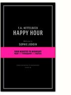
Two years ago today, my friend and poet FA Nettelbeck died. A month earlier Four Minutes to Midnight published his final book of poetry, Happy Hour, with illustrations by Sophie Jodoin. I had planned to perhaps visit him over the holidays that year, take a trip with my brother down to the backwoods of Oregon, with a box of books in tow. Those plans fell apart, and in the new year, I was contacted by his sister Sandra, first to let me know that he was in the hospital, and soon after to let me know that he had died. I didn’t know that he had a sister. She didn’t know that he had a publisher.
I wrote briefly about our time “together” shortly after his death, and today, it’s weighing real heavy on me again. Things are looking pretty ugly to me right now, with a lot of blame to go around in this frigid country. The list is long, and probably not worth mentioning here, but the world looks a lot like he saw it, and I wish he could write it down for me. Set it on the page, or at least the screen.
(more…)
Illegibility, Ugliness and Counter-Hegemony

A contentious spread from 032c issue #13
In my current phase of design research, I’ve been enjoying a wealth of ecclectic readings. My friend and craft theorist extraordinaire Nicole Burisch pointed me in the direction of Judith (or rather, Jack) Halberstam‘s excellent introduction to The Queer Art of Failure. In referencing James C. Scott’s Seeing Like A State, he writes:
For Scott, to “see like a state” means to accept the order of things and to internalize them; it means that we begin to deploy and think with the logic of the superiority of orderliness and that we erase and indeed sacrifice other, more local practices of knowledge, practices that may be less efficient, may yield less marketable results, but may also, in the long term, be more sustaining. What is at stake in arguing for the trees and against the forest? Scott identifies “legibility” as the favored technique of high moderism for sorting, organizing and profiting from land and people and for abstracting systems of knowledge from local knowledge pratices. (…) “Legibility,” writes scott, “is a condition of manipulation”. He favors instead, borrowing from European anarchist thought, more practical forms of knowledge that he calls metis and that empahsize mutuality, collectivity, plasticity, diversity, and adaptability. Illegibility may in fact be one way of escaping the political manipulation to which all university fields and disciplines are subject.
Albeit largely due to the use of the term “legibility”, this section sparked some interesting ideas in relation to the material practice of graphic design and typography. Translating the argument literally (pun intended) to design practice, I can’t help but think of the so-called “legibility wars” of the 90s, and to a lesser extent the ideas of vernacular design put forth by the practice of Tibor Kalman. I’ve always felt the deconstructionist work being done by this generation of designers was abandoned too soon (or at least the theory was), as discourse shifted towards “new media” (with a brief moment of introspection on the political potential of design) and aesthetics shifted towards a nostalgic, serious, and safe, faux-modernist/classicist current (largely due, imho, to the events on 9/11 and Dave Eggers).
(more…)
It begins in the book…
I’m so excited to come across James Stuart’s Master’s Thesis “It Begins in the Book: Writing the Material Poem” freely available online. An expansive thesis, it comprises an 80-odd page exegesis and 3 creative projects (The Material Poem, The Homeless Gods and Conversions). The overlap between his interests and my own is startling, given the niche nature of my concerns.
My reading of Stuart’s written thesis has sparked many ideas for my own research, specifically around his three-pronged model of materiality:
“what enables, and how does, a reader to respond to a literary work (material basis); what socio-cultural forces influence the relationship between writers, readers and the language-object (materialism); and finally, the actual material expression (or materiality) of a language-object.”
Coming from his background as a poet, Stuart’s examples and references are new and fascinating to me, and his analytic focus on poetry (specifically in its definition re: its material basis) has given me a lot to chew on.
(more…)
2 quotes + an image

Tomato, mmm… skyscraper, I love you.
“…in the best instances, a double reflexivity is at work: a medium is (re)constituted in a recursive way that is nonetheless open to social content—in a way, moreover, that reminds us that “form” is often nothing but “content” that has become historically sedimented.”
– Hal Foster, This Funeral is for the Wrong Corpse
“Literature in the written sense represents the triumph of language over writing: the subversion of writing for purposes that have little or nothing to do with social and economic control.”
– Robert Bringhurst, The Solid Form of Language
Thinking through some things as I embark on the research and conception phase for the next issue of Four Minutes to Midnight, specifically around the materiality of texts. It’s all a little vague right now, but I feel I’m working towards something quite original and interesting. Here’s hoping. I’ll be documenting my process on here as I go…
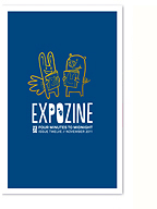
Expozine 2012 recap

Four Minutes to Midnight table at Expozine
This year’s Expozine weekend was another smashing success, with an especially impressive roster of exhibitors, including many new artists and publishers, and a great vibe all around. It seemed slightly less crowded and chaotic than usual, which was nice, allowing people to engage more with the exhibitors. For this year’s edition, in addition to my normal organising duties, I also helped to redesign the website (code by Hello Everyone, full implementation still in progress…), and got to see my new logo silkscreened onto tote bags and t-shirts!
It was so nice to get to see all our self-publishing friends again (like seeing fam for the holidays without the emotional turmoil), and table alongside Billy Mavreas and Larissa from the Concordia Co-op Bookstore. An entertaining (to say the least) set of neighbours!
Though we didn’t have a new issue of Four Minutes to Midnight out for the fair, we had plenty of fun stuff available (pictured above). The Wu-Tang prints were incredibly popular, as was our new set of poems. We completely sold out of Riot and Capitalism Kills Love prints, which makes me feel that all is all right in the world (despite the current news headlines). We didn’t sell a ton of back issues (the Expozine Issue and Happy Hour), but I was really happy to share their stories with those that were interested. John’s Hard Mouse Best Mouse, an EP of quickly written and recorded song sketches, was also a really nice treat.
(more…)
2 Poems

For Expozine this year, John and I pulled together this small zine consisting of two hard-wrought poems. The poems were composed/written by us over the course of 4 days and nights, addressing our tried and true themes of love and loss, gentrification and war, isolation and community, solidarity and suicide.
Despite the short timeline (we were stapling and folding into the wee hours of Saturday morning), I’m really proud of these little poems and the elegantly restrained format and typography. The zine was published in a limited edition of 50 copies.
Download a PDF of 2 poems here.
Read 2 poems online on Issuu.