* Resistance *

Jack Allen pointed me towards this beautiful visual essay by designer and artist Paul Soulellis. In it he narrates and argues for a counterpractice of design that I can very much sympathise with. It’s an inspirational read for the new year, and will surely help to guide how I approach my projects in 2014.
Read it here.
Come Worry With Us!

I was honoured to work on the poster and title designs for Helene Klodawsky’s film Come Worry With Us! The documentary tells the story of one of my favourite bands, Thee Silver Mt. Zion Memorial Orchestra, focusing on the struggles of balancing parenthood with the life of touring musicians. It raises very timely questions around the pervasiveness of traditional gender roles, and the challenges of artists living within a precarious economy. It’s a beautiful, intimate portrait, blending the political and the personal, and I’m really pleased to have been a part of it.
Visit the film’s website here.
(more…)
Interviewed by Papirmass

Papirmass is an amazing art subscription project run by the talented Kirsten McCrea. I was honoured to have Kirsten invite me to contribute to the upcoming issue, as both writer and designer (with art by former Four Minutes contributor Kevin Ledo on the flip side). In lead-up to the issue, Papirmass has just posted an image-rich interview with yours truly, and I couldn’t be more chuffed to share some thoughts on design, typography and activism!
Read the interview here.
P.S. For those that make it all the way to the end, there’s a little surprise in store on the studio front. More on that very soon…
WU-TANG Letterpress Prints

For Expozine this year, I’ve reissued a run of my WU-TANG C.R.E.A.M. diptych, letterpress printed in gold ink on thick black cardstock by Kiva Stimac at Popolo Press. This edition is printed on her new letterpress, and the imprint is slightly deeper, giving it more relief and emphasizing the epitaph metaphor of the design.
(more…)
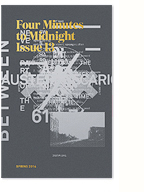
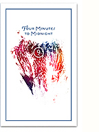
Issue 13 WIP

Things are coming along slowly, but surely, with the next issue (13) of Four Minutes to Midnight and I wanted to share some work in progress images. Alongside a much tighter conception of what we want to do with the issue, I’m very excited to announce that Howl Arts will be officially supporting the project with production and distribution. With this support, we’ve decided to print an offset run in colour for the first time ever! We also plan to engage the talents of local craft printers, and employ letterpress, silkscreen and risograph printing for covers and inserts.
(more…)
Neptune’s Moons Poster

Show poster designed for the upcoming Neptune’s Moons concert presented by the Howl Arts Collective. Though the central graphic acts as a literal interpretation of the title, the poster also makes subtle reference to Afro-futurist aesthetics and sci-fi 70s funk in the digitally-lettered title treatment. It’s too bad we won’t be printing this with glow-in-the-dark ink!
In conceiving of the show, Kaie highlighted this quote by Marc Dery:
“Hack this: Why do so few African-Americans write science fiction, a genre whose close encounters with the Other — the stranger in a strange land — would seem uniquely suited to the concerns of African-American novelists? Yet, to this writer’s knowledge, only Samuel R. Delany, Octavia Butler,Steve Barnes, and Charles Saunders have chosen to write within the genre conventions of SF. This is especially perplexing in light of the fact that African-Americans are, in a very real sense, the descendants of alien abductees. They inhabit a sci-fi nightmare in which unseen but no less impassable force fields of intolerance frustrate their movements; official histories undo what has been done to them; and technology, be it branding, forced sterilization, the Tuskegee experiment, or tasers, is too often brought to bear on black bodies.”
– Mark Dery, Black to the Future
Word.
Neptune’s Moons event page here.
Lokimon Tumblr

Updates are slow on the zine, but things are happening nonetheless. Meanwhile follow lokimon on tumblr, updated far more frequently with plenty of inspirational imagery.
Tumblr mosaic created here.
I.T.U.
I’ve mentioned the International Typographical Union in a few of my recent blog posts, both the historical union itself and the design group aligned to, and inspired by it. Above is a short slide show showcasing projects by the latter group, and below is a concise contextual history of the former that I’ve written for the next issue of FMTM.
The International Typographical Union was the first national labour union in the United States, founded on May 5, 1852 (the name was changed from National to International in 1869 after it began organizing members in Canada). The I.T.U. was composed of typesetters, printers, apprentices and journeymen, and was considered one the most democratic and progressive unions; condemning Sunday work, actively supporting organizing efforts by other craft unions, and being among the first to institute membership by women, with Augusta Lewis Troup becoming the first woman (in 1870) to hold a national office. In 1906, the I.T.U. secured the eight-hour work day through the use of tactical strikes in major cities, paving the way for a standard that would be implemented across other industries. After World War I, when employers sought to lengthen the work day to 12 hours , the I.T.U. fought back with massive strikes across the country, engaging in a three-year long battle that cost employers dearly, successfully defending the union’s significant gains.
On December 31, 1986, the I.T.U. dissolved, largely due to the automation, mechanization and digitalization of the trade. The remnants of the union membership merged with the Communications Workers of America and the International Brotherhood of Teamsters.
More great slideshows by Charlotte Cheetham on printed matter here.
Sketch for Sunday: Perpetual Krisis

A little collage I made today combining an old photo of mine from my trip to Portugal and a painting from Alex Schaefer‘s burning banks series. I think it works quite well, and if I can find a way to reproduce it nicely, it should make it into the next issue of Four Minutes to Midnight.