^
^
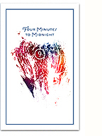
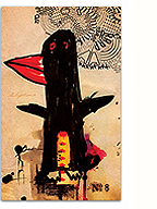
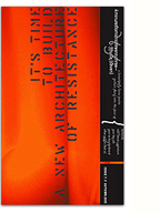
to better reflect the studio’s current philosophy and offering. The mark and identity is still being fully developed, but I wanted to get something up there for now. Let me know what you think!
2 Comments
2 Comments so far
Leave a comment
I think this is good direction. It projects your studio more fully and with some flair !
Comment by Pius Eugene 02.11.09 @ 1:23 amThanks Pius! Have you received your copies of the magazine yet?
Comment by kevin 02.11.09 @ 1:28 amLeave a comment


