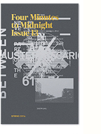
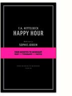
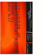
The latest redesign of the design content site Thinking for a Living is turning web paradigms onto their side. With mobile standards in mind, an intuitive and simplified navigation, alongside a very refined approach to web typography, I have a feeling that this site could really change how we design for the web. Built with XHTML/CSS and jQuery, the site is delivered through WordPress but feels nothing like it…
It’s a site I’ve often visited for their quality content and design coverage, which is generally more in-depth and better written than most design “blogs” out there (yours truly included). Now it’s even easier on the eyes and provides a really fluid reading experience. Way to go guys. Hopefully this thoughtful, holistic, and detail-oriented approach to design serving content catches on.
Read about the redesign in the first issue here.
1 Comment so far
Leave a comment
Leave a comment


