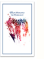
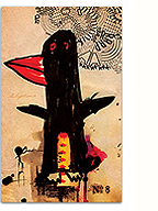
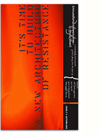
With the new year rapidly approaching and imminent full-time freelance work on the horizon, I recently designed myself some spiffy new business cards. The cards were beautifully letterpress printed by the Mandate Press in Salt Lake City onto a richly textured 110# Cranes Lettra stock, with fluorescent pink edging. The above photo hasn’t been retouched, these cards really glow!
A few notes on the design itself since I’ve never really addressed my “branding” here before:
The wordmark is set in a subtly customised version of House Industries’ Neutraface 2 text (the display version didn’t have the weight I wanted). I tweaked the letterforms to make them slightly more geometric and modern and notched the “i” to reflect how I write LOKi with a lowercase “i” (a story unto itself). Meticulous kerning creates an even letter flow, while simultaneously marking a differentiation between “LOKi” and “design”.
The icon is based on the “L” and”D” of my mashup typeface Hel Grotesk Gothiq, reflecting a desire to be avant-garde, hybrid and historical at the same time.
The text face is Underware’s Dolly, one of my all-time favourite book faces. The overall feel I hope is literary without being dull, humanistic without being old-fashioned, and professional without being clinical.
I highly recommend Mandate, who offer great quality, competitive pricing and a smooth design workflow. As they say, “Everything looks better letterpressed.”
There you have it, new cards for a new year and the sign of many new and exciting projects to come.
2 Comments so far
Leave a comment
Pink edging — what beauty! While I wish you lots of freelance success, Kevin, the thought of you distributing these cards and only for them to end up bent or dirtied in unknown wallets makes my heart flutter sadly.
Comment by kfreek 12.03.10 @ 10:47 amLeave a comment


