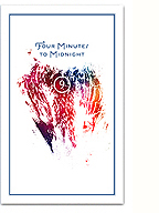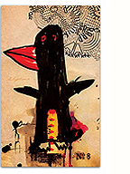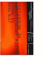
Mrs. Eaves, the first typeface I fell in love with…
It’s hard to overstate the impact Emigre magazine had on my graphic design training. Beyond being the purveyors of a distinct typographic style that embodied the age I grew into design, the magazine hosted the critical discussion of design as a deeply rhetorical practice that was unavailable anywhere else, and sadly, has been clearly lacking since its demise in 2005 (well worth the read!).
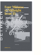
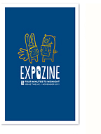
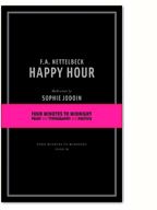
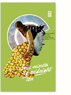
Emigre recently announced that their collection of beautiful type specimen catalogues are now available online as downloadable pdfs. Taken together, they form a great overview of the foundry’s history, and more generally of a distinct period of graphic design exploration (not that their typefaces have lost their relevancy today).
No Comments so far
Leave a comment
Leave a comment


