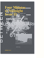
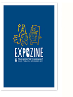
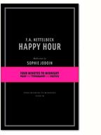
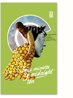
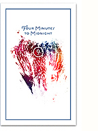
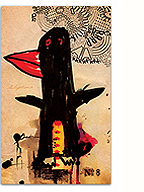
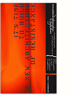
I recently decided to gather a selection of the logos and wordmarks I’ve designed for a wide variety of clients over the years. I’ve always really enjoyed the challenge and reward of (re)defining the visual identity of a company or organisation, and the design of the logo is at the root of this process. For me, there is a clear emphasis on using strong, simple typography, complemented by a touch of graphic wit from which the rest of the identity can emerge.
Some of these date back almost ten years, but still look pretty fresh (imho)!
2 Comments so far
Leave a comment
PII – really awesome logo, who was it for? Google did not return any meaningful result with “promiscuous/infrastructures/imprint” as keywords.
Comment by Eugene 06.08.12 @ 7:38 pmHi Eugene, PII was designed for an exhibition at the artist-run centre Skol, organised by the Artivistic collective (of which I am a member). You can read more about it here: http://www.skol.ca/en/past/promiscuous-infrastructures-phase-2
Comment by kevin 06.09.12 @ 12:31 pmLeave a comment


