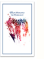
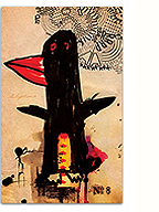
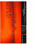
I was honoured to work on the poster and title designs for Helene Klodawsky’s film Come Worry With Us! The documentary tells the story of one of my favourite bands, Thee Silver Mt. Zion Memorial Orchestra, focusing on the struggles of balancing parenthood with the life of touring musicians. It raises very timely questions around the pervasiveness of traditional gender roles, and the challenges of artists living within a precarious economy. It’s a beautiful, intimate portrait, blending the political and the personal, and I’m really pleased to have been a part of it.
Visit the film’s website here.
I have to admit, it was pretty intimidating to work on the design for a project about one of my favourite bands, especially since they have such a strong aesthetic of their own. At the same time, it was a project “about” them, and not “by” them, so some critical distance had to be taken as well. In the end, I opted for a typographic approach that I feel is inspired by the same references, but without an attempt to mimic their voice. The film is also a bit of a love letter to the Mile End neighbourhood, so I’m particularly happy with the photo I took for the poster, shot through a dirty window on the 11th floor of 5333 Casgrain.
Title design is something I’ve rarely done, and with a tight turnaround time, I tried to keep it pretty simple, with just a few flourishes here and there. Manually adding a bit of texture and roughness to the type pulled it all together. The titles were then animated by Faisal Lutchmedial.
4 Comments so far
Leave a comment
Cool beans Lo …! Keep us informed of screening times and the like
Comment by Marc B 12.12.13 @ 4:52 pmLooks really good! The film has a pretty cool website too
Comment by Todd 12.12.13 @ 5:46 pmOops, thanks. How embarrassing! The screens shown here were taken from my comps. It’s correct in the final film, and corrected here now.
Comment by Kevin 12.16.13 @ 10:40 amLeave a comment


