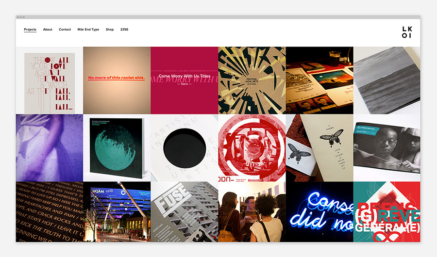
After several months of reflection, strategy and design, I’m proud to launch LOKI as an independent design studio resolutely focused on graphic design and social change work. The (re)launch includes an overhaul of our visual identity, a new website to showcase our portfolio of work, and the clarification of our positioning and purpose.
Bringing together over a decade of work split between the commercial, cultural and community spheres, the formation of LOKI marks a renewed and unified commitment to the creation of images, objects, and experiences that empower, engage and oppose. Graphic design aligned with movements, organizations and individuals that contribute to positive social change.
The launch also marks LOKI’s establishment within a great new office space in the Mile End, shared with Studio Byebye Bambi, JLL Photography and Pauline Loctin. If you’re in the neighbourhood, please feel free to come by for a visit some time!
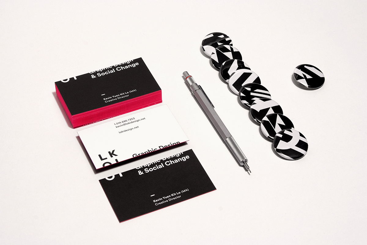
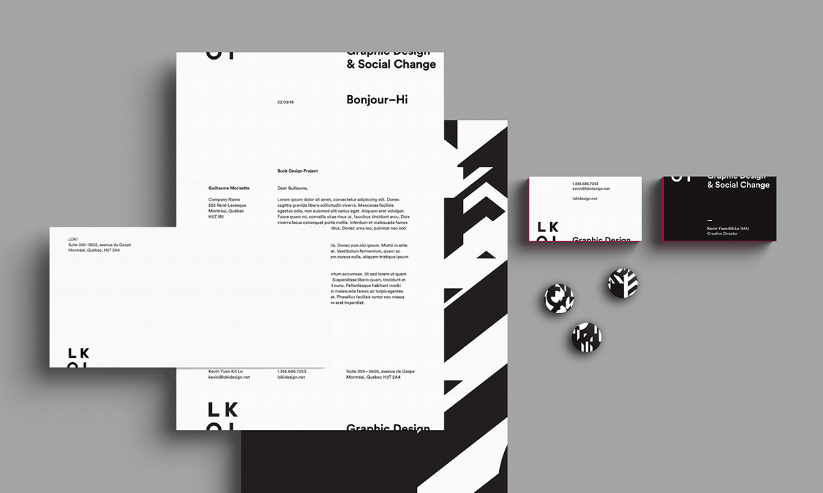
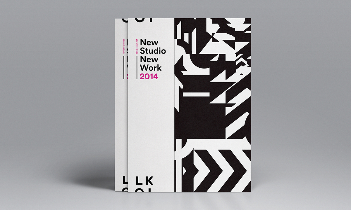
The visual identity is centred on being “off-centre”. Bottom-left to be precise, bleeding off the bottom of the canvas and returning on top; alluding to our politics, the potential of our work, and as a subtle stab at a staid graphic design industry that would never want to do something that might harm the “brand” (or legibility for that matter). The logo itself subverts the traditional (Western) reading direction, and embodies our exacting, yet experimental, approach to typographic design.
A contrasting black and white colour palette (with flashes of hot pink) references the studio’s contestational/dialectical style of graphic design, complemented by typography that grounds the identity within a modernist design tradition. The supporting graphic pattern is composed of the positive and negative shapes of the logo, adding an important touch of structured chaos to the mix.
View more identity visuals here.
Beyond acting as a portfolio, the new website features a couple of other sections I’m quite excited about.
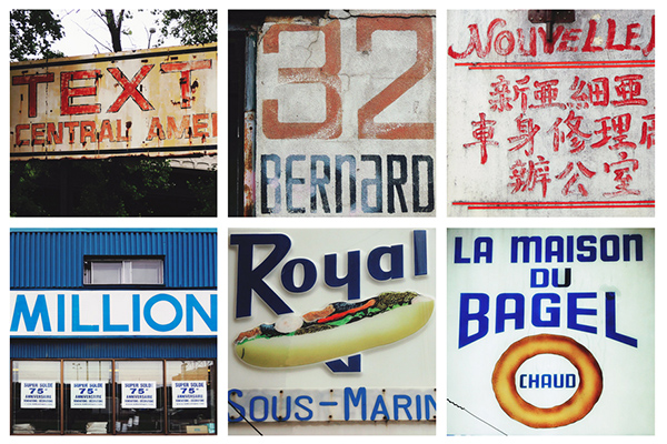
The Mile End Type project is an ongoing documentary archive of vernacular typography in the Mile End neighbourhood. It is proposed as a critique of the rampant gentrification of the neighbourhood, with the hopes of sparking other, more radical, political actions.
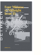
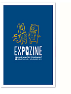
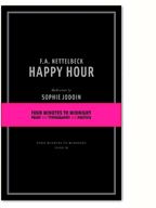
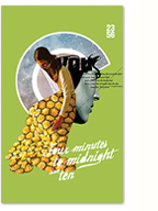
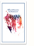
The website also includes a simple, straight forward storefront to sell the growing collection of printed matter published through 2356. We’re very proud of the latest issue of Four Minutes to Midnight, an assemblage of radical poetics, photography, and short essays on design, which is now available for orders everywhere!
Personally, this marks a transition from freelance work to a studio structure, a somewhat subtle, but important strategic shift. After bouncing back and forth between my activism and my commercial practice for many years, too often working on projects that didn’t make sense to my politics, I’ve learned a lot along the way and I’m now ready to “put my money where my mouth is” (irony intended). I’m really excited about this evolution, and am eager to meet collaborators and clients that are aligned to the studio’s new vision. Don’t hesitate to contact us if you have a radical idea you’d like to develop.
There are many new projects in the works, so please stay tuned here, or follow us on facebook or twitter.
No Comments so far
Leave a comment
Leave a comment


