States of Grace

One of the highlights of my trip back home over the holidays was the 2 hours of Super 8 footage that my dad had digitised of old home movies he shot back in the seventies and early eighties. My brother diligently edited it down to a shorter compilation, which I scored, and we shared some nostalgia-soaked memories with the family.
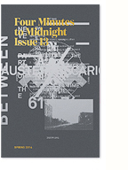
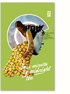
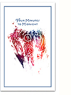
As a designer/communicator, nostalgia is something I think about a lot (cue the carousel scene from Mad Men), and I knew I wanted to do something with this footage that explored these ideas. However, I didn’t want to emphasize the personally nostalgic moments, rather, I wanted to focus on the unique aesthetic of the images and the (digitised) film itself. It was quite a trip to sit through all the footage again in order to extract these select images, and I feel they’re somehow imbued with that personal investment. I’m not sure what I’m going to do with them yet, a few will certainly make it into the next issue of Four Minutes to Midnight, but for now I thought I would post them here.
(more…)
You were a true poet / down to your scarred knuckles

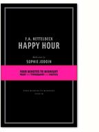
Two years ago today, my friend and poet FA Nettelbeck died. A month earlier Four Minutes to Midnight published his final book of poetry, Happy Hour, with illustrations by Sophie Jodoin. I had planned to perhaps visit him over the holidays that year, take a trip with my brother down to the backwoods of Oregon, with a box of books in tow. Those plans fell apart, and in the new year, I was contacted by his sister Sandra, first to let me know that he was in the hospital, and soon after to let me know that he had died. I didn’t know that he had a sister. She didn’t know that he had a publisher.
I wrote briefly about our time “together” shortly after his death, and today, it’s weighing real heavy on me again. Things are looking pretty ugly to me right now, with a lot of blame to go around in this frigid country. The list is long, and probably not worth mentioning here, but the world looks a lot like he saw it, and I wish he could write it down for me. Set it on the page, or at least the screen.
(more…)
That New Design Smell

Following a certain line of thinking from my Ugliness article, I recently discovered the work of Michèle Champagne, designer and editor of the critical design magazine That New Design Smell. Michele is doing some really interesting work (out of Toronto!) that seems to share a lot of my current interests, though her expression of them is quite different (she’s far funnier/more optimistic than I am).
Check out her work here.
PS. On a slightly related note, here’s a refreshing article by Michael Bierut on the sad state of design criticism (and a heated comments thread, though a lot of the comments are logocentric and missing the fine point at the end of Bierut’s article calling for a reengagement with critical design writing) .
Trend List

In yesterday’s lengthy post I touched on notions of trend cycles in graphic design. And then I discovered Trend List, an amazing and overwhelming catalogue documenting current stylistic tendencies in graphic design.
At the root of what I’m thinking about, and what I assume most graphic designers think about, is how cultural/political currents become embedded into the formal structures of design, and vice versa. Maybe staring at this site for a few hours will help…
Illegibility, Ugliness and Counter-Hegemony

A contentious spread from 032c issue #13
In my current phase of design research, I’ve been enjoying a wealth of ecclectic readings. My friend and craft theorist extraordinaire Nicole Burisch pointed me in the direction of Judith (or rather, Jack) Halberstam‘s excellent introduction to The Queer Art of Failure. In referencing James C. Scott’s Seeing Like A State, he writes:
For Scott, to “see like a state” means to accept the order of things and to internalize them; it means that we begin to deploy and think with the logic of the superiority of orderliness and that we erase and indeed sacrifice other, more local practices of knowledge, practices that may be less efficient, may yield less marketable results, but may also, in the long term, be more sustaining. What is at stake in arguing for the trees and against the forest? Scott identifies “legibility” as the favored technique of high moderism for sorting, organizing and profiting from land and people and for abstracting systems of knowledge from local knowledge pratices. (…) “Legibility,” writes scott, “is a condition of manipulation”. He favors instead, borrowing from European anarchist thought, more practical forms of knowledge that he calls metis and that empahsize mutuality, collectivity, plasticity, diversity, and adaptability. Illegibility may in fact be one way of escaping the political manipulation to which all university fields and disciplines are subject.
Albeit largely due to the use of the term “legibility”, this section sparked some interesting ideas in relation to the material practice of graphic design and typography. Translating the argument literally (pun intended) to design practice, I can’t help but think of the so-called “legibility wars” of the 90s, and to a lesser extent the ideas of vernacular design put forth by the practice of Tibor Kalman. I’ve always felt the deconstructionist work being done by this generation of designers was abandoned too soon (or at least the theory was), as discourse shifted towards “new media” (with a brief moment of introspection on the political potential of design) and aesthetics shifted towards a nostalgic, serious, and safe, faux-modernist/classicist current (largely due, imho, to the events on 9/11 and Dave Eggers).
(more…)
LOKi design now on Pinterest
I honestly didn’t think it would come to this, especially with all the social/bookmarking networks I’m already on, but I’ve finally started using Pinterest, and I’m actually finding it pretty useful and fun! Not so much as a way of discovering, but more as a way of keeping track of various and often ephemeral inspirations.
Follow me here!
2 quotes + an image

Tomato, mmm… skyscraper, I love you.
“…in the best instances, a double reflexivity is at work: a medium is (re)constituted in a recursive way that is nonetheless open to social content—in a way, moreover, that reminds us that “form” is often nothing but “content” that has become historically sedimented.”
– Hal Foster, This Funeral is for the Wrong Corpse
“Literature in the written sense represents the triumph of language over writing: the subversion of writing for purposes that have little or nothing to do with social and economic control.”
– Robert Bringhurst, The Solid Form of Language
Thinking through some things as I embark on the research and conception phase for the next issue of Four Minutes to Midnight, specifically around the materiality of texts. It’s all a little vague right now, but I feel I’m working towards something quite original and interesting. Here’s hoping. I’ll be documenting my process on here as I go…
Expozine! Expozine! Expozine!

Expozine 2012 poster by Simon Bossé
It’s that time of year again, the smell of toner is in the air and the copyshops are all a hustle. Expozine is taking place this weekend, and we’re really excited here at Four Minutes HQ. We’ve been working hard to organise the event and put the catalogue together, and things are crazy hectic right now, but this year’s festival promises to be a good one.
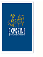
Unfortunately, we don’t have a new issue out, but John and I will still be pulling together a few smaller items for you, including a new “chapbook” of 2 poems, a rough-cut CD of music by John/Triangles, and a selection of prints I’ve produced over the last year (I’m very excited about the limited edition C.R.E.A.M. diptych). Of course, we’ll also have previous issues of Four Minutes for sale, including our special Expozine edition from last year!
The exhibitors list this year looks really impressive, and I can’t wait to discover everyone’s new creations and hang out with my fellow zinesters.
See you there!


