Haut Les Mains

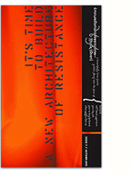
In the midst of these tumultuous times, my good friend Frédéric Dubois is organising this timely community education event on the nefarious practices of the Canadian banking system. I helped him out by quickly designing this poster/handbill, inspired by the visuals of the student movement.
Hope to see you there!
Patrick Watson Website

To coincide with the launch of Patrick Watson‘s latest album, Adventures in Your Own Backyard, I recently revamped his website with production and dev by Ombilicus Mundi. I’ve always been greatly inspired by Watson’s cinematic music, and the goal of this design was simple; showcase the music and get out of the way. We did just that, devising a docking content column that sits on top of full-screen videos, allowing visitors to immerse themselves in the experience.
(more…)
Memefest 2012: Debt

My long-standing collaboration with Memefest continues as I was asked by Oliver Vodeb to create the visuals for this year’s festival on the very timely theme of Debt. We decided to take a poetic, slightly ambiguous approach, with many subtle references, reflecting our complex relationship (and resistance) to debt.
The critical text that grounds the festival is excerpted from David Graeber’s excellent book Debt: The First 5000 Years. From the call for submissions:
DEBT IS EVERYWHERE.
It shapes our lives and defines our world.
Debt takes power from the people and places it in the hands of bankers and experts.
It wasn’t always this way.
Can we imagine a different relationship to debt?
(more…)
Howl V featuring Seth Tobocman

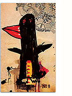
This coming Friday, Howl! Arts will be presenting a performance by renowned radical graphic artist Seth Tobocman, launching his latest book Understanding the Crash. Seth’s work as an artist and organiser has been central to social justice struggles over the last three decades, from the squatters movement in New York’s Lower East side in the 80s, the anti-globalisation movement in the 90s, the Palestinian solidarity movement, mobilizing support in new Orleans after Hurricane Katrina, to the Occupy movement today. We’re very excited to be bringing this important artist/activist to Montreal alongside author Eric Laursen.
Local musicians Marathon, and the Chaotic Insurrection Ensemble, whose raucous music has animated countless protests and rallies, will also be performing.
More info on Howl! Arts.
RSVP on facebook.
Promiscuous Infrastructures Exhibition

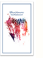
Promiscuous Infrastructures (Phase II) aims to visualise/materialise Artivistic’s research practice and create an inviting space for others to reflect and participate. The exhibition/installation is based around four separate, but promiscuous spaces; a central print workshop for making zines, a research library, a meeting space, and a dining room. The typo/graphic message in Skol’s entranceway (pictured above) subtly describes the political context of the project.
(more…)
Manifestation étudiante 22 mars

Some views from the crowd during yesterday’s amazing mass protest against the tuition hikes. 200,000+, nous ne reculerons pas!
(more…)
Love Letters to Montreal
Thursday March 15th 2012, 1:36 am
Filed under:
portfolio
One of my projects in the Promiscuous Infrastructures show is a diptych collage that consists of all (well, most) of the posters I’ve designed for cultural/political events in the city over the last few years. Mostly for free… It’s a reflection on value and the affective relationships built through working together on things that “matter.” The city has given me so much, and these are my love letters back to it, made from paper, ink, flour, water and a touch of honey…
Making them was a cathartic experience, there’s nothing like tearing up years of work up and putting it back together again.
(more…)
Another teaser…

…for our upcoming show at Skol. Letterpress printed by Kiva at Popolo Press.
Previous teaser here.
CKUT logo design

CKUT 90.3 is Montréal’s most-listened to (and best loved) community radio station. Since I first moved to the city 15 years ago, I’ve been an avid fan of their progressive and diverse programming, so I was really happy to get the chance to work with them on the redesign of their upcoming website.
As I embarked on the project, it quickly became evident that I would need to rework CKUT’s logo. Like many grassroots organisations, professional design standards were difficult for them to maintain, and the identity system lacked consistency both conceptually and practically. Many different iterations and distortions of the logo were being used, and a vector master file did not even exist!
I thought it might be enlightening to break down the redesign of the logo and my thinking behind it.
(more…)


