
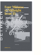
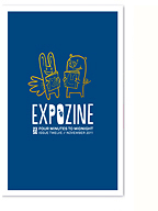
I quickly whipped up these poemcards to promote the upcoming issue at expozine.Just a little taste of things to come.
1 Comment


I quickly whipped up these poemcards to promote the upcoming issue at expozine.Just a little taste of things to come.

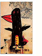
A while back I mentioned a series of art posters I had designed to promote and raise funds for 2356. So finally, here they are! If you’re interested in purchasing one or more and supporting the cause, please drop me a line. Size is in and around 12″ x 18″, printed digitally on matte archival stock. More designs will be coming soon once I get the new studio set up (pics of that will be coming soon too!).

Some great news for web designers/integrators who truly care about good typographic standards (I know there are some of you out there!). My former co-worker Stephane Curzi introduces Baseline, a designer framework that beautifully translates classical typographic standards to the web. Baseline is elegant, flexible and robust and it’s available as a free download that contains CSS files, a Photoshop document and a full set of HTML templates.
It’s initiatives like these, with their minute attention to detail, that will finally make the web worth reading. Good work Stephane!
Emanuelle Enchanted was a collaborative typography project conducted by my fellow students and I during our MA course at the London College of Printing in 2004. The two-day project was based on a brief by tutor Paul McNeil that instructed us to design selected extracts from experimental theatre company Forced Entertainment’s play of the same name. The results, when seen as a whole are pretty impressive, and I’m reminded of how lucky I was at the time to be surrounded by so many talented individuals.
Part two after the jump.

Here’s a beautiful set of sexy “illuminated” letters designed by Airside for Wallpaper‘s Sex & Art issue. Graphic, in both senses of the word. You can find the backstory, sketches, and more visuals on Airside’s Blog.

Isn’t the internet GREAT? Shortly after posting Paranoid to the public domain, Ukranian (type) designer Sergiy S. Tkachenko sent me an email with a reworking of paranoid that includes a few extra glyphs as well as the cyrillic components. Thanks so much Sergiy, the zero glyph is super sexy…
Download Paranoid (updated file)

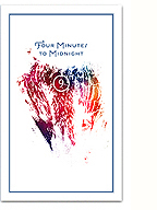
Paranoid is a project we’ve had going on the back burner for a while now, and we’re happy to announce its official public and FREE release. Collaboratively designed by Simon Carrasco, John Stuart and myself, Paranoid is a purely geometric display face developed as a contribution to, and subtle critique of, the still growing trend of bold, geometric and counterless typography. It can be used equally well to bring back the joy of cocaine clouded 80s dance parties or to express the ominous foreboding of inevitable nuclear disaster, a flexible face in spite of its limited form.

I recently stumbled across this beautiful flickr set by F-letter and was struck by the perfect, simple harmony of his typography and imagery, a balance I continually strive for, but can never seem to achieve. Everything is just perfect in these images and they’ve raised an interesting side story into the script face that pairs so well with one of my favourite sans, Trade Gothic.

