= something actually interesting in design discourse
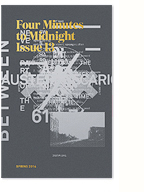
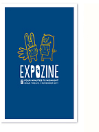
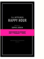
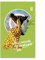
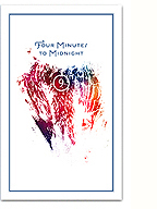
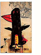
LOKi design/Four Minutes to Midnight/me have been featured in issue #3 of Snap Magazine, which was launched last night. Snap is a free Montreal lifestyle/culture mag that showcases creative, eclectic, local content. My friend Erica Ruth Kelly conducted the interview, in which we talk briefly about design and the genesis of FMTM. The interview features a nice selection of my work, and a “portrait” photo shot by Xavier Tolentino at the Cossette offices is tucked away on page 53. All around good stuff…
You can pick up a copy at cafés and stores around town or check out the issue online here. Many thanks to Erica and the girls at Snap for the feature!

Cover design for Racine: A Perfect Hand
Racine (aka Yan Basque Thériault) asked me to help him out with the sleeve design for his first full-length album, A Perfect Hand. I was more than happy to oblige and work with the beautiful surreal illustration provided by Nicole Aline Legault.
Not visible in the comp above was the marrying of TSTAR mono and Mrs. Eaves for the track listings on the back… trust me, it actually works!
The album itself is inspired, technically masterful and emotionally powerful, with lyrics influenced strongly (I believe) by Situationsit thinking. How can you go wrong?
“We’ve been choosing more and more and creating less and less for some time now, but I am just catching on that in becoming a society of choosers rather than of creators, we a rebecoming a society of people who take the passive role: the traditionally female role. Increasingly, we’re leaving the driving to others. We are leaving the fine, feathered display, the “choose me to be your mate” role, the traditionally male role, to the corporations that purvey products. It’s like the old sex dance of penguins or cockatoos, and we are the quiet one, the silent one, the female one, and the producer is the showy one, the one who offers, the male one. What will happen as we—both men and women—shift from expressing ourselves individually by making things into expressing ourselves only by choosing? What will happen to us as a culture when we have been completely conditioned only to choose between options, rather than come up with solutions?”
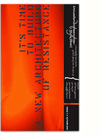
I recently designed this ad to promote reknowned MTL graffiti artist Omen‘s upcoming show at Yves Laroche. The show’s not for a while yet, but the ad is going to be featured in the October issues of both Juxtapoz and Hi-Fructose magazines. We’ll also be issuing limited edition art prints/posters of this design during the show, so needless to say I’m pretty excited.
I just stumbled upon Wordle, a java-based word cloud generator. Though the interface/visual design could use some tweaking, and the typeface selection is a little restrictive (dare I say, cheesy…), it still produces some interesting, and at times beautiful, results. More importantly, it’s a lot of fun to play with and an addictive little time-waster for the typographically-inclined.
I discovered this BEAUTIFUL song by Adem over the weekend and now I can’t get it out of my head. So I thought I’d share… A melding and reinterpretation of two Aphex Twin classics into a beautiful (yes, I say it again), dreamy, hope-filled ‘folk’ song. Impressive and inspiring…
To cure a weakling child / Boy / Girl Song (MP3)
The song is from his latest album, ‘Takes’, which features 12 cover versions of songs from 1991-2001. His eclectic selection of artists and songs, including Yo la Tengo, Smashing Pumpkins, Tortoise, PJ Harvey and Low, seems spot on. Can’t wait to pick it up.
It’s hard for me to believe that I launched LOKi design (labs) over 8 years ago now. Life is certainly quite different these days, but browsing through my archives, I’m surprised by how much has stayed the same within my work. It was nice to see the amount of (strange) self-initiated work I did and think about how it has in many way lead to the zine project. The numerous iterations of my site (this blog would officially be version 7!) that I created and carefully attended to over the years help me to believe that I genuinely do love this medium.
Looking back it’s also interesting to trace the currents and trends of (web) design that I voraciously followed and suppose in many ways still do. From the pointless lines and 45 degree angles, to miniscule pixel type, vector shapes and grungy posterised images, its all in there, part of my endlessly self-conscious searching for form. Presented here for your enjoyment/amusement, a selection of images from those years.


