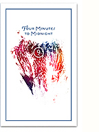
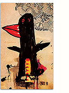
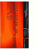
I’m a little late posting this one, but I finally got my hands on a copy of Kaie Kellough‘s latest album, Vox: Versus, which I designed back in May. Kaie is an amazing Montreal-based poet, whose work deconstructs and reconstructs language, blending word-games with sound poetry, dub and jazz. The collected works on this latest offering present a series of collaborations with a group of talented local musicians, exploring the roots of rhythm, language and the inherent politics within them (ArtThreat interview with Kaie here).
The resulting typographic design represents these experiments and improvisations in language, and the wintery mood of the album. Printed by Standard Form in Toronto, the matte stock complements the sparse design beautifully. A nice object to hold in the hand while Kaie’s unique voice enters your ears and mind.
2 Comments so far
Leave a comment
yep. that’s right. not only beautiful design but amazing words and track inside!
Comment by moe 08.26.11 @ 11:58 ambeautiful design work!
perfect for linguistic landscapes of Kaie Kellough!
Leave a comment


