Great little documentary on Inkahoots, an inspiring design studio we very much look up to.
As part of this year’s Toronto Design Offsite festival, LOKI will be presenting a collaborative exhibition with Studio JayWall. I met Jay at the AMC conference last summer in Detroit, and I’m excited to get to work with him on this exhibition that merges our interests in typography and the dynamics of cities.
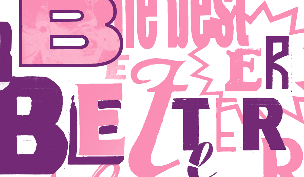
Reading/Writing the Junction is a documentary project that examines and reimagines the signage and lettering of the Junction neighbourhood, as an oblique commentary/criticism on gentrification and urban change.
The collaboration also extends to the brilliant JP King at Paper Pusher, who will be producing the series of risograph prints that will be exhibited/distributed as part of the show.
The exhibition opens on Jan. 21 (fb event here), and runs until the end of February. Hope to see you there!
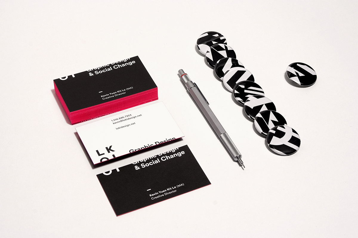
After several months of reflection, strategy and design, I’m proud to launch LOKI as an independent design studio resolutely focused on graphic design and social change work. The (re)launch includes an overhaul of our visual identity, a new website to showcase our portfolio of work, and the clarification of our positioning and purpose.
Bringing together over a decade of work split between the commercial, cultural and community spheres, the formation of LOKI marks a renewed and unified commitment to the creation of images, objects, and experiences that empower, engage and oppose. Graphic design aligned with movements, organizations and individuals that contribute to positive social change.
The launch also marks LOKI’s establishment within a great new office space in the Mile End, shared with Studio Byebye Bambi, JLL Photography and Pauline Loctin. If you’re in the neighbourhood, please feel free to come by for a visit some time!
A beautiful video of pure letterpress goodness, from a master of the craft. More info here.
“The word is the canary, and its feathers are falling out.”
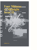
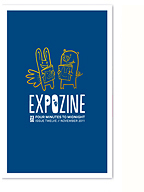
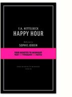
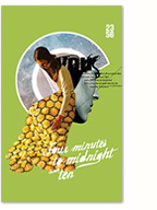
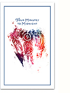
After an extended hiatus, Four Minutes to Midnight returns with our thirteenth issue, a lovingly produced edition of typography and poetics, photography and collage, design polemics and radical politics, paper and ink. Thematically, the issue emerges out of our experience of the Québec Student Strike, but is not specifically “about” it, acting more as a reflection on 10 years of community organising, designing and publishing, making music, and strolling through gentrifying neighbourhoods in opposition to neoliberal capitalism.
The issue features visual art, writing and design from a diverse host of local and international contributors, including the Dutch design studio Experimental Jetset, performance artist and author Jacob Wren, Montreal photographer Vo Thien Viet, Toronto writer and editor Hillary Rexe, and the Montreal artist and collagist Madame Gilles.
Filed under: 23:56 issues,events,miscellaneous,type and typography
The long awaited (in my mind at least) thirteenth issue of Four Minutes to Midnight is in the final stages of production. The screen-printed covers have been delivered to the printers, Kata Soho, and they’ve just finished the interior printing on their end. Next steps; cutting down the sheets, collating the pages, binding, and trimming to the final book block. Exciting stuff!
I’ll be posting the details of the issue itself when it’s ready, but for now I wanted to share some in process images and announce the upcoming launch party. We’re excited to be launching the issue as part of the Howl Arts Festival, Tuesday, April 29th at le Cagibi, with musical performances by Loosestrife, Stefan Christoff and our own John “Triangles” Stuart. An inaugural festival of art and revolution seems to be the perfect context to bring this zine/book into the world, especially considering how Four Minutes to Midnight acted as a touchstone to Stefan and I forming the Howl Arts Collective all those years ago. This has been a very long time coming, so we’re hoping you can make it out to celebrate with us.
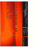
Working with the FARD (Féministes anti-racistes détonant.e.s) collective, I designed a series of typographic posters in opposition to the proposed Quebec Charter of Values and its inherent racist agenda. Produced as part of the latest issue of the .dpi journal, the goal of the series is to render public opposition more visible within the city’s cultural venues and in the streets.
I was honoured to work on the poster and title designs for Helene Klodawsky’s film Come Worry With Us! The documentary tells the story of one of my favourite bands, Thee Silver Mt. Zion Memorial Orchestra, focusing on the struggles of balancing parenthood with the life of touring musicians. It raises very timely questions around the pervasiveness of traditional gender roles, and the challenges of artists living within a precarious economy. It’s a beautiful, intimate portrait, blending the political and the personal, and I’m really pleased to have been a part of it.
Visit the film’s website here.
Filed under: about,news,reading and writing,type and typography

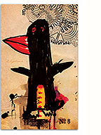
Papirmass is an amazing art subscription project run by the talented Kirsten McCrea. I was honoured to have Kirsten invite me to contribute to the upcoming issue, as both writer and designer (with art by former Four Minutes contributor Kevin Ledo on the flip side). In lead-up to the issue, Papirmass has just posted an image-rich interview with yours truly, and I couldn’t be more chuffed to share some thoughts on design, typography and activism!
P.S. For those that make it all the way to the end, there’s a little surprise in store on the studio front. More on that very soon…


