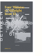
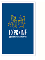
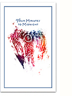
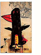
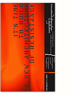
From Keetra :: A wealth of beautiful, playful and wonder-inducing design work from Keetra Dean Dixon. Also check out her interview on Cranbrookdesign.com.
^
^
to better reflect the studio’s current philosophy and offering. The mark and identity is still being fully developed, but I wanted to get something up there for now. Let me know what you think!
Chris Papasadero of FWIS fame attempts to design a typeface every day for 31 days. So far, its looking good, and I wish him all the luck. Add this to FWIS’ lengthening list of assorted design initiatives like readymech and the amazing book covers blog.
I love this project by Emily Webber, the daily documentation of London shop fronts in all their vernacular glory. The dead pan images bring me back to my time spent amongst these shops (with a certain, irrepressible touch of nostalgia), and the project as a whole is a vivid testament to vernacular typography and the individualism of the entrepreneurs and local culture. Good stuff…
via Colin via Boing Boing.

Hel Grotesk Gothiq is featured in the second edition of Judith Schalansky’s ‘Bible of Blackletter’ Fraktur Mon Amour. Check out Armin’s review over at Speak Up! Congratulations and thanks Judith, it’s a beautiful book!
UPDATE 26/12/08: …it’s a beautiful book, which I now OWN! Thanks baby!!!
Filed under: type and typography
A typographic sketch I made for Issue 10 that never made it through the final cut. I still really like the idea behind the typeface and if anyone is interested in expanding the design into a full family, please let me know. I would give it a try myself, but can’t find the time right now. Any takers?
 you,
you,
dressed in a formica yellow flower-print skirt
dark eye’d long leg’d, sweet lip’d,
took a pull from the bottle and
blew a line of smoke into the sky,
laughing “fuck them!”
(it didn’t really matter who)
and I fell into it then…
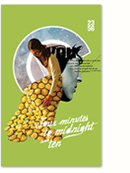
The tenth issue of Four Minutes to Midnight explores the idea of radical beauty (a theme inspired from this year’s Memefest) interpreted through the words and images of over 30 artists. Our ‘anniversary’ issue is the thickest (and prettiest) one yet, clocking in at a tidy 180 pages.
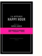
Some of my personal favorites among the diverse work featured in the issue include a selection of poetry from American ‘outsider’ poet F.A. Nettelbeck, two collaborations between myself and Montreal photographer Dita Kubin, a series of beautiful, seductive portraits painted by Kevin Ledo, and the surreal illustrations from my former student Ilinca Balaban.

‘Printing in the Shadow of Aldus.’ Image copyright Peter Koch.
The latest issue of the Fine Press Book Association‘s journal, ‘Parenthesis,’ is beautifully documented in this flickr set. Enjoy!


