Hand Made Font

An interesting and brilliant idea by Estonian designers Vladimir and Maksim Loginov. Picking up on current trends, they offer a wide selection of “hand made fonts” available for purchase, download and use. Each letter is an incredibly detailed, beautifully rendered piece of work, check out Skeleton, for example. There’s definitely some bad mixed in with the good, and I find the prices a bit steep, but the concept and execution are top notch.
Have a look for yourself!
Wordle

I just stumbled upon Wordle, a java-based word cloud generator. Though the interface/visual design could use some tweaking, and the typeface selection is a little restrictive (dare I say, cheesy…), it still produces some interesting, and at times beautiful, results. More importantly, it’s a lot of fun to play with and an addictive little time-waster for the typographically-inclined.
Read at Work

Emily_Dickinson_I Bring_An_Unaccustomed_Wine.ppt
www.readatwork.com | A pretty damn silly/funny campaign site for the New Zealand Book Council that (unintentionally) raises some interesting questions on literature and visual form. More parody than paradox, yet also uncomfortably close to the sacrilegious…
link via SpeakUp.
Hel Grotesk Gothiq

Hel Grotesk Gothiq Typeface. 2006.
This typeface was born as the bastard love child of Helvetica Neue and Wilhelm Klingspor Gotisch during a tryst they had one sad, desperate night. The calligrapher seduced the industry leader with her curves, elegant vocabulary and hand skills. But the affair was not to last, and though their union was never recounted (Helvetica being one to bury the past), the hidden story of that night lives on in Hel Grotesk Gothiq.
I designed Hel as a critique of the supposed neutrality and authority of Helvetica and the stylistic reappropriations of Blackletter typefaces in contemporary design. A subversive typeface steeped in history and irony.
FREE download of Hel Grotesk Gothiq (OTF).
Hel is an all-caps typeface, and can prove a little difficult to work with on her own. However, her hefty-size and shape works perfectly paired with lowercase Helvetica Neue Black (she’s her daddy’s little girl…).
(more…)
Pelican Books Cover Gallery
 The very interesting Things Magazine website features an amazing gallery of vintage Pelican Book covers from the 1930s to 1980s. According to the Penguin website the Pelican imprint was launched in 1937 to “cover serious contemporary issues and represented the first new and original books to be published by Penguin… The series was weighted towards History, Sociology, Economics and Politics and continued the ‘good books cheap’ philosophy of Penguin.”
The extensive gallery is an amazing historical and aesthetic archive. The 1960s collection is particularly revealing of the revolutionary nature (both technological and cultural) of the times.
Also worth checking out is David Pearson Design‘s recent work for Penguin, especially the Great Ideas series (direct links here, here, and here) . Mmmm… debossed type on uncoated paper stock. Beautiful…
I am praxis…

Jason Gillingham (issue 9 contributor) just sent me this beautiful image, composed with rub-down lettering at our launch party.
Four Minutes to Midnight: Issue Nine
 For the ninth issue of Four Minutes to Midnight, we sent out a call for submissions with the tentative theme of “conflict and silence” and were happy to receive responses that explored this relationship through personal and autobiographical perspectives. Gathering these together alongside numerous fragments found along the way, the issue was crafted over the course of a year in the margins of our days and nights. It was truly a labour of love to produce and we hope that it shows…
Featuring the work of over 25 contributors, FMTM 9 is filled with 112 pages of radical textual & visual stimulation. Without a doubt, our sexiest issue yet!
The issue will be launched this weekend at lab.synthese, with musical guests Parlovr, Flames! and American Devices.
(more…)
Pop and Politics: Music Making Change

Pop and Politics Poster Series, 2005
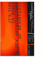
A series of posters designed for the 2005 edition of the Pop and Politics conference, part of the Pop Montreal music festival. Working with my good friend Jay Delmarr, we created a series of bold typographic posters to promote the conference which dealt with wide-ranging issues at the intersection of music and politics. The conference included performances by Saul Williams and K’naan, two of my favourite artists, and having the opportunity to design these posters was an absolute treat.
(more…)


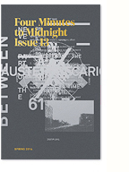
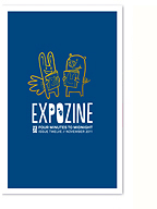
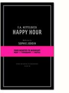
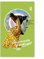
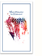
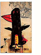


 For the ninth issue of Four Minutes to Midnight, we sent out a call for submissions with the tentative theme of “conflict and silence” and were happy to receive responses that explored this relationship through personal and autobiographical perspectives. Gathering these together alongside numerous fragments found along the way, the issue was crafted over the course of a year in the margins of our days and nights. It was truly a labour of love to produce and we hope that it shows…
