Filed under: music
I recently stumbled across this fascinating article from the Walker Art blog describing designer Sang Mun’s degree project at RISD: ZXX. ZXX is a type design project that attempts to “articulate our unfreedom” through the design of a typeface that cannot be decoded by OCR technologies. In light of the recent revelations about the NSA Prism program , this project is particularly relevant.
What’s interesting to me is how this project seems to bring together inherent aesthetic cues of the “ugly” trend (I really need to come up with a better term for my understanding of this) that I’ve been discussing here (the distortion/layering of type elements and placement, the concept of default/open-source design, issues of illegibility/accessibility, through to the presentation of the project) with a critical social commentary of the surveillance state and privacy concerns. It makes me wonder whether this “state of anxiety” may be at the root of the aesthetic currents running through graphic design practice.
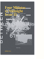
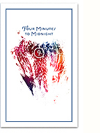
What’s also really encouraging is that ZXX might be a representation of a re-engagement with design language, and typography/type design specifically, as a form of critical engagement and aesthetic experimentation, much like Neville Brody’s FUSE project from the 90s. Hopefully it’s not just closing a loop, but a “sign” (pun intended) of things to come. I’ll certainly be taking some of these cues into, and using the typeface within, the next issue of Four Minutes to Midnight.
See more of the project, and download the typeface, here.
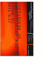
Street poster designed for Brahja Wladman’s Quartet (Quintet for the show) double album launch this Friday at Café Resonance. Howl co-produced the album, and I also designed the CD packaging, images coming soon.
Facebook event here. Photo by the city’s best poster paster-upper, Stefan Christoff.
Last weekend I was invited to participate in a small symposium/dinner at the N/A space in Toronto on the subject of “Critical Graphic Design”. Organised by Chris Lee and Patricio Davila, the dinner brought together a diverse group of (mostly local) designers, educators, researchers and activists to chat informally about what critical graphic design might be, with the goal of moving towards a series of workshops in the summer.
I was honoured to be invited amongst the numerous guests, which included a couple of old friends, a couple of design heros, and generally all people I’d like to get to know better: JP from Paper Pusher, Anouk from Studio Feed, Sheila from The Public, Abake, Michelle Champagne, members of the Beehive Collective, and many more.
It was a pleasure to meet everyone around a delicious potluck, and I was really excited by the prospect of this re-engagement with design discourse. Unfortunately, I wasn’t able to stay very long, and I wish I had had a chance to speak with people more in depth. Nonetheless, quite a few interesting ideas emerged from that night, and I’ll sketch a few of them out here.

My arm and the back of John’s head at last year’s May 22 manif
I’m surprised I haven’t posted about my friend and collaborator Thien V‘s work on here before now. Thien is a talented young photographer who has established himself as one of the preeminent documentarians of the unprecedented social uprisings in Montreal over the last few years.
I’ve worked with him as a fellow collective member of both Artivistic and Howl, and I wanted to give him a quick, but deeply-felt shoutout as I’ve been thinking a lot about photography, memory and the student strike lately. Working towards the next issue of Four Minutes to Midnight, I realise I want to use it as a way of documenting and translating my own experience of the last few years. Thien has been along for most every step of the ride, at shows, protests, meetings, and meals, so who better to collaborate with on this. Now I just need to scour through the thousands of images he has shot!
What I particularly like about Thien’s photos is not necessarily the strength of individual images, nor the politically-charged subject matter, but how the numerous small moments he captures add up to an authentic and intimate representation of experience, not so much a narrative, but a very specific “vibe”. It’s this vibe I want to work with, and explore ways to treat the images graphically (through design and printing) to bring it out even further.
Visit Thien’s website Quelques Notes.

SSENSE: Beyond Control Editorial
I’ve sadly neglected this blog for a while now, due to some big changes and challenges in my professional and personal life. To my “loyal readership”, my sincerest apologies. The big news is that after a very introspective January, I decided to take on a full-time position as the Art & Design Director at SSENSE, a leading Montreal-based fashion company. The images above are from my first ever fashion editorial!
This is my first in-house job, and I’m quickly learning that the challenges are quite different than those of agency or freelance work, but I’m really excited to be able to dig so deep into, and feel ownership over, a single, unique brand. I’ve also been impressed by how different the fashion industry is from the advertising industry. Obviously, there are a lot of overlaps, but the attention to purposeful craft is very refreshing. The creative team at SSENSE is very talented and there are big plans for the company on the horizon, so please stay tuned. Here’s hoping my immersion into the world of fashion might also improve my wardrobe as well!


