Logo folio

I recently decided to gather a selection of the logos and wordmarks I’ve designed for a wide variety of clients over the years. I’ve always really enjoyed the challenge and reward of (re)defining the visual identity of a company or organisation, and the design of the logo is at the root of this process. For me, there is a clear emphasis on using strong, simple typography, complemented by a touch of graphic wit from which the rest of the identity can emerge.
Some of these date back almost ten years, but still look pretty fresh (imho)!
(more…)
#GGI Poster Portfolio

In solidarity with the student strike in Québec, and inspired by the work of l’École de la montagne rouge, Kim and I have designed a small portfolio of street posters for the movement. We’re hoping that once we get them up in the city they’ll help to encourage the students to continue their just struggle. The posters also aim to extend the critique of the tuition hikes to challenge the austerity politics that they are an intrinsic component of, and to firmly denounce the draconian measures the Charest government is using to enact them.
(more…)
LSTK type

My good friend Constantin Demner over at Studio Elastik, has just released a series of three hand-lettered typefaces for free download (LSTK Bembo, GaraPen Tiny, and Clarendon). Coco and I did our MA together at LCP way back in 2004, and these fonts were drawn during that time. It’s great to see them re-emerge online.
I’ve used his version of Clarendon extensively for the Howl poster series, and look forward to playing around with the other fonts soon.
Be sure to check out all his great work!
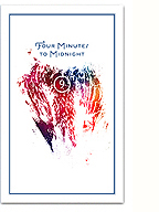
The end of February (2012)

The last time I did this, people seemed to really enjoy it. So, for your viewing and browsing pleasure, I present a carefully curated series of images and inspirations to mark the end of the shortest-longest month.
Images link to the original sources.
(more…)
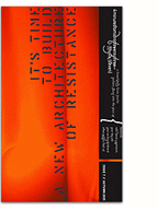
Another teaser…

…for our upcoming show at Skol. Letterpress printed by Kiva at Popolo Press.
Previous teaser here.
CKUT logo design

CKUT 90.3 is Montréal’s most-listened to (and best loved) community radio station. Since I first moved to the city 15 years ago, I’ve been an avid fan of their progressive and diverse programming, so I was really happy to get the chance to work with them on the redesign of their upcoming website.
As I embarked on the project, it quickly became evident that I would need to rework CKUT’s logo. Like many grassroots organisations, professional design standards were difficult for them to maintain, and the identity system lacked consistency both conceptually and practically. Many different iterations and distortions of the logo were being used, and a vector master file did not even exist!
I thought it might be enlightening to break down the redesign of the logo and my thinking behind it.
(more…)
Closed but Unlocked


In the context of Patrice Loubier’s “furtive practices” residency at Skol, I designed the door-front signage for the gallery. Skol will be hosting Artivistic’s exhibition in March (some teaser images to come soon), so I was happy to help out and get a chance to test the detail of their vinyl lettering. Yum!
Ink & Paper
ink&paper from Ben Proudfoot on Vimeo.
A beautiful mini-documentary directed by Ben Proudfoot about the last letterpress and paper shops in Los Angeles. I really appreciate how the precarious situation of these traditional crafts is highlighted, counterpointed by the interviewees obvious love for them. If you’re in Los Angeles, please support these stores!
Blanch Font Family

An early Christmas present from Barcelona-based design studio Atipus! They’re offering a free download of Blanch, a beautiful modular typeface that balances 50s modernism with a unique contemporary flair. Blanch was designed for the striking visual identity of organic fruit business Fruita Blanch, which you can check out here.
Thanks guys, I’m looking forward to using Blanch in future projects. Download the Blanch font family here.
Found via David Airey.
UPDATE: Blanch has just been released by the amazing Lost Type Co-op, which features a slew of stylish pay-what-you-can typefaces.