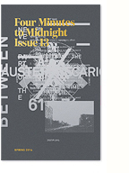
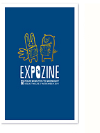
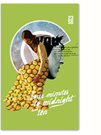
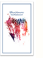
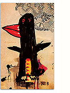
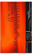
Back in November, I was contacted by the brilliant Dutch photographer Aram Tanis with a series of striking photos he wanted to submit for the zine. We were in the process of finishing up Happy Hour at the time and weren’t taking submissions, but I really wanted to work with his images. So, I suggested a little experimental print project, inspired by Claire Fontaine‘s Capitalism Kills Love installation at Art Basel Miami (which was surprisingly taken down before the event).
With the new year rapidly approaching and imminent full-time freelance work on the horizon, I recently designed myself some spiffy new business cards. The cards were beautifully letterpress printed by the Mandate Press in Salt Lake City onto a richly textured 110# Cranes Lettra stock, with fluorescent pink edging. The above photo hasn’t been retouched, these cards really glow!

What’s My Motherfuckin’ Name?
2009 marks four decades of me being a published poet
in this once greatest country so try and find any of my
books in your local bookstore and you’d be shit out of
luck yet if I had similarly wasted my life doing
almost anything else I could be retired by now with a
modest check and better teeth but all I’ve got to show
are consequential words across an empty white space– Happy Hour’s epigraph
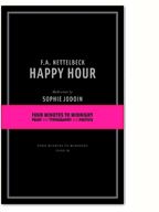
The eleventh issue of Four Minutes to Midnight is a radical break from the format of the last four issues, consisting of Happy Hour, a book of 60 poems by F.A. Nettelbeck, lavishly illustrated by Sophie Jodoin, and Fugue XI, printed and bound as a slim edition of 28 pages. Production details include a double bump of silver ink on black cardstock covers, bright pink endpapers and a hand stamped bellyband holding the books together. Interior pages are printed on Rolland Enviro100 paper (FSC 100% post-consumer fibre, chlorine free process using biogas energy). The double-issue is printed in an edition of 350 copies.
Filed under: inspirations,miscellaneous,reading and writing,type and typography
On Friday, I received my much anticipated copy of Ruud Linssen’s Book of war, mortification and love in the mail. Published by one of my favourite typefoundries, Underware, the book, which consists of a collection of personal essays on the concept of “voluntary suffering”, also acts as a type specimen for their Blackletter typeface Fakir.
The book is beautifully designed and crafted, which is not a surprise given the quality of Underware’s work. I was pleasantly surprised by how well Fakir reads as a text face though, since I had always considered it a bit of a playful display typeface. Even more impressive is how well it sits in such a serious and sombre context, accentuating the darkness of the essays with its jagged edges.
To make up for the negativity of the previous post and the recent lack of activity on this site, please enjoy this series of lovely murals by Steve Powers in Philadeplhia. Much love!
As a little bonus, have a listen to this hauntingly beautiful session from Bon Iver.
Beautiful, intriguing, crafty and smart work by Alex Egger at Satellites Mistaken for Stars. Really loving the hand drawn type on the site, looks like a lot of work…
Filed under: events,portfolio,reading and writing,type and typography
The following is a rough transcript of the presentation (in franglais) I gave last week at Pecha Kucha Night MTL. For those that are unfamiliar with the event’s format, presenters are asked to present 20 slides, commenting on each for 20 seconds, resulting in a fast-paced 6m40s presentation. More details about the event here.

01. This is my desk. The organisers asked me to focus on presenting process work tonight, and I think it’s equally important to always look at context, so here’s my desk, my after-hours working environment, and over the next few slides, I’ll explain a bit about who I am to further contextualise what I’m going to be presenting.

image by Post Typography
02. Je suis un designer graphique avec des tendances anarchiste. Ça veut dire quoi avoir des tendances anarchistes? Pour moi ça veut dire que je crois fortement dans la collectivité non-hierarchique, je m’alinge avec des luttes minoritaires, et que je suis un romantique sans espoir. Par contre je ne suis pas un member du AIGA, mais je trouvai l’illustration assez drole.
(more…)
Filed under: inspirations,miscellaneous,photography,type and typography
A few days late, but I thought it would be a nice idea to mark the end of what ironically always feels like the longest (and darkest) month here in Montreal with a long and chunky post filled with inspirational images selected from all my various feeds. Hope you enjoy the collection, and if there’s a modicum of interest, maybe I’ll make this into a regular feature.
The latest redesign of the design content site Thinking for a Living is turning web paradigms onto their side. With mobile standards in mind, an intuitive and simplified navigation, alongside a very refined approach to web typography, I have a feeling that this site could really change how we design for the web. Built with XHTML/CSS and jQuery, the site is delivered through WordPress but feels nothing like it…
It’s a site I’ve often visited for their quality content and design coverage, which is generally more in-depth and better written than most design “blogs” out there (yours truly included). Now it’s even easier on the eyes and provides a really fluid reading experience. Way to go guys. Hopefully this thoughtful, holistic, and detail-oriented approach to design serving content catches on.
Read about the redesign in the first issue here.


